Hi, I'm Marisol.
I design products at scale.
10+ years across mobile apps, SaaS, e-commerce, and websites. I lead a product design team, run Discovery for new products, and design work that moves business metrics, not just looks good in Figma.
Featured work
Six projects across faith & family, logistics, travel, fintech, B2B marketplaces, and health tech, from discovery to user testing.
Design that ships.
Decisions that scale.
Head of Design with 10+ years across mobile apps, SaaS, e-commerce, and websites. Here's the longer story: background, experience, and the toolbox.
 Based in Mexico
Hybrid background,
research-first mindset.
I've shipped 25+ digital products across mobile apps, SaaS platforms, e-commerce, and consumer websites, covering health tech, fintech, AI, B2B, on-demand, and more.
As Head of Design at Geekbears, I own the design function end-to-end: design quality and delivery across client projects, the design revenue line, and new business from first lead to closed account. My work spans the full cycle: research, IA, prototyping, design systems, and developer handoff.
I bring a hybrid background: 10+ years of design with a strong visual foundation, technical fluency in front-end (HTML/CSS), and active use of AI tools to accelerate research and design workflows. I work in Spanish (native) and English (full professional), day to day with US teams.
Jul 2026 to PresentHead of DesignGeekbears · US digital product agency
- Lead a team of 3 product designers across ~15 concurrent client projects in mobile, web, and SaaS
- Set design standards, review all major deliverables, and run hiring, mentoring, and sprint planning
- Own the design P&L: revenue pipeline, milestone progression, invoicing, and AR follow-up
- Drive new business from first call to signed account, leading consultations and proposals
- Productized the design offer (Discovery, UX/UI, Validation, MVP Launch Plans) to lift conversion
- Build working front-ends and prototypes with AI-assisted development (Lovable, Claude, Cursor)
Jul 2025 to Jun 2026UX/UI Design ManagerGeekbears
- Cut design turnaround time by 34% by introducing an AI-first design workflow across the team
- Built the Discovery methodology: problem statements, personas, journeys, sitemaps, benchmarking, MVP prioritization
- Managed scope, deadlines, and workload delegation across parallel projects
Aug 2024 to Jun 2025UX/UI DesignerGeekbears
- End-to-end design for B2B platforms, mobile apps, and AI products, including multi-role design systems
- Promoted to Design Manager within 11 months
2024 to Dec 2025Freelance UX/UI DesignerFragmenta · part-time
- Designed and shipped responsive websites, e-commerce stores, and educational platforms, from wireframes to hi-fi UI
- Worked directly with clients to define scope, present concepts, and iterate through launch
- Ran UX audits and usability testing to find friction and prioritize improvements
- Prepared developer-ready handoff files and specs, and supported implementation QA
2023 to 2024UX/UI DesignerDivLabs
- Designed responsive websites, e-commerce, educational, and management platforms
- Built and maintained web design systems; ran user research, usability testing, and synthesis
2021 to 2023Marketing ManagerGrupo Elga
- Designed and executed digital marketing strategies for the group's companies
- Developed websites and campaign landing pages for multiple brands
- Supervised web development with external vendors; graphic design for digital and print
2020 to 2021Visual DesignerGrupo K12 del Noroeste
- Created and scheduled social media content; produced videos and animations
- Designed institutional websites and graphic materials for digital and print
2018 to 2020Visual DesignerErus SA de CV
- UX/UI design for the company website, employee learning platforms, and a sales mobile app
- Graphic design for digital and print; social media content, videos, and motion graphics
2016 to 2018Jr. Graphic Designer & Community ManagerFaccinetto Arquimagología
- Designed and executed social media campaigns and content
- Graphic design for digital and print media; videos and motion graphics
Capabilities
Research-driven, system-minded, and execution-focused, with leadership experience across cross-functional product teams.
Remain
A faith-based app that helps families build daily spiritual habits together: personal and family routines, scripture, prayer, and reflection. I took it from Discovery through brand, UI, user testing, and iteration. It is now in development.
Faith habits that the whole family can keep
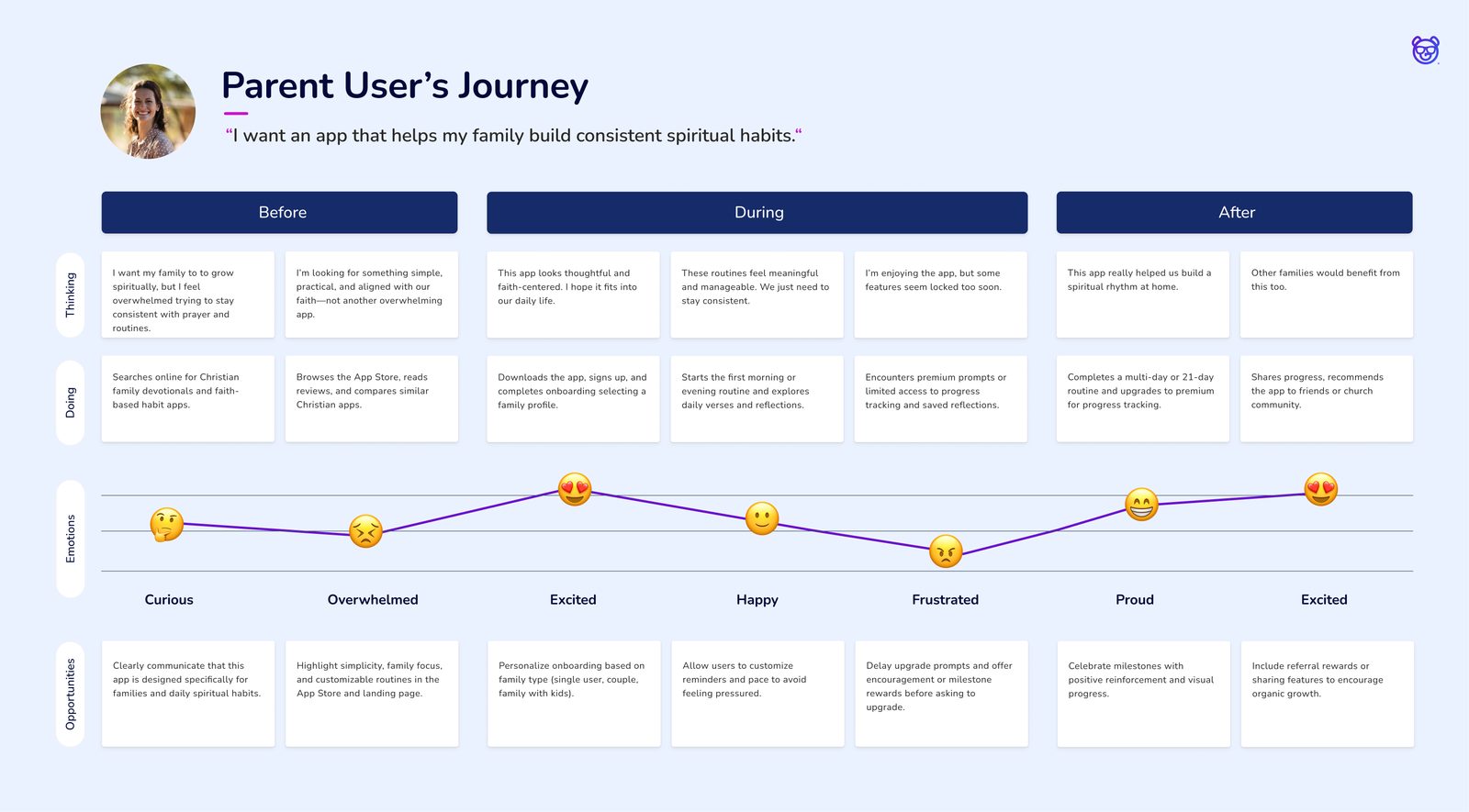
Families who want a faith-centered home struggle to keep shared spiritual habits alive between busy schedules and competing responsibilities. Most tools are built for one person, not for a household with parents, kids, and different life stages.
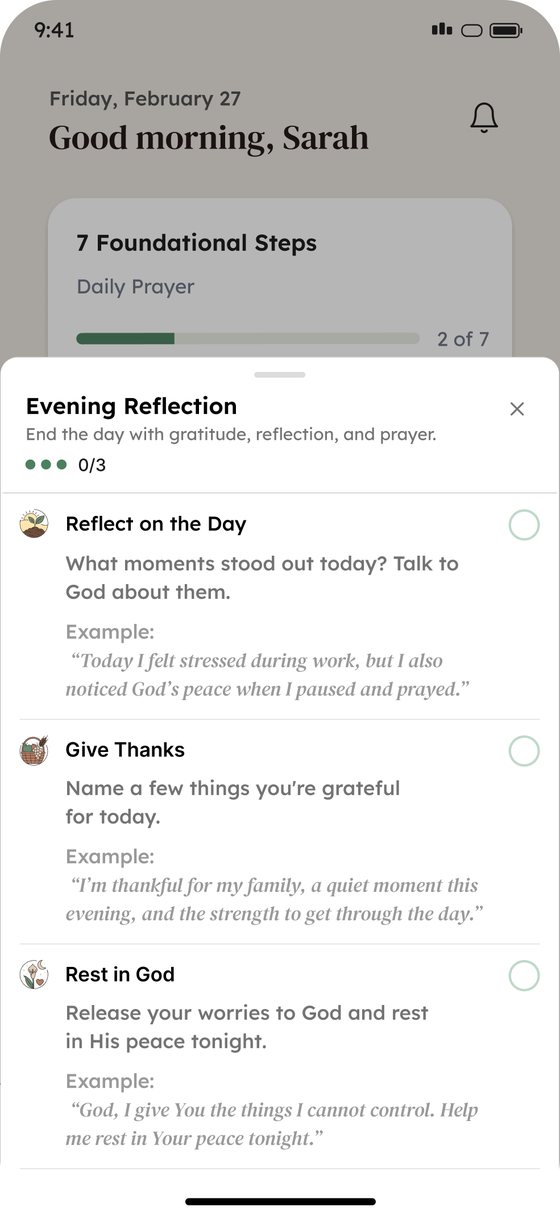
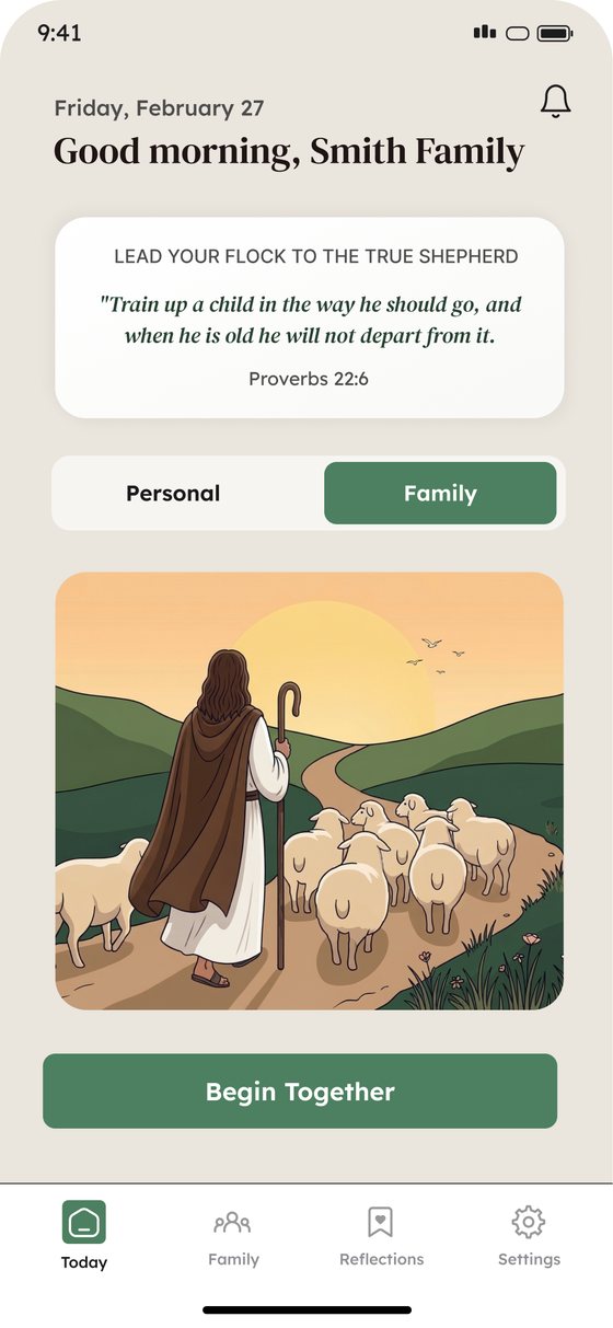
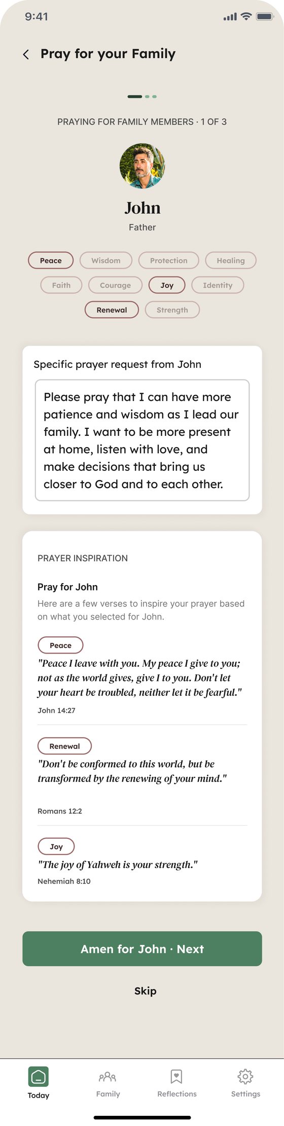
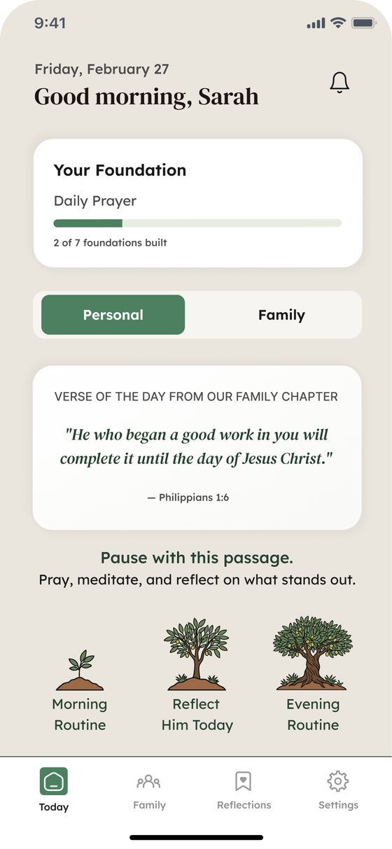
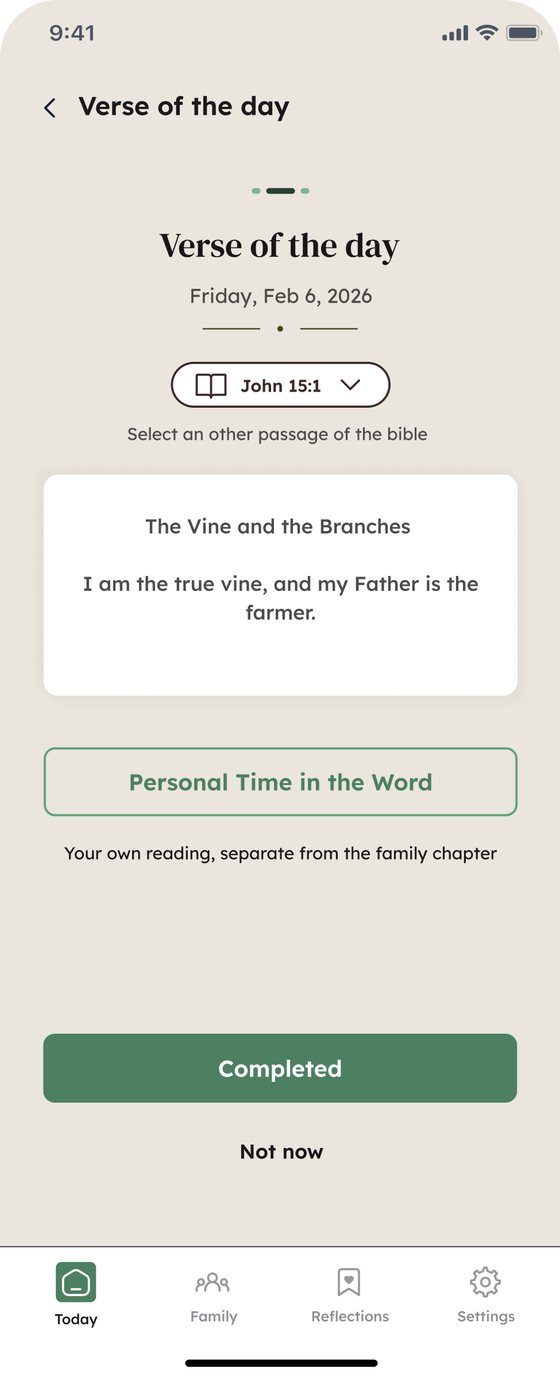
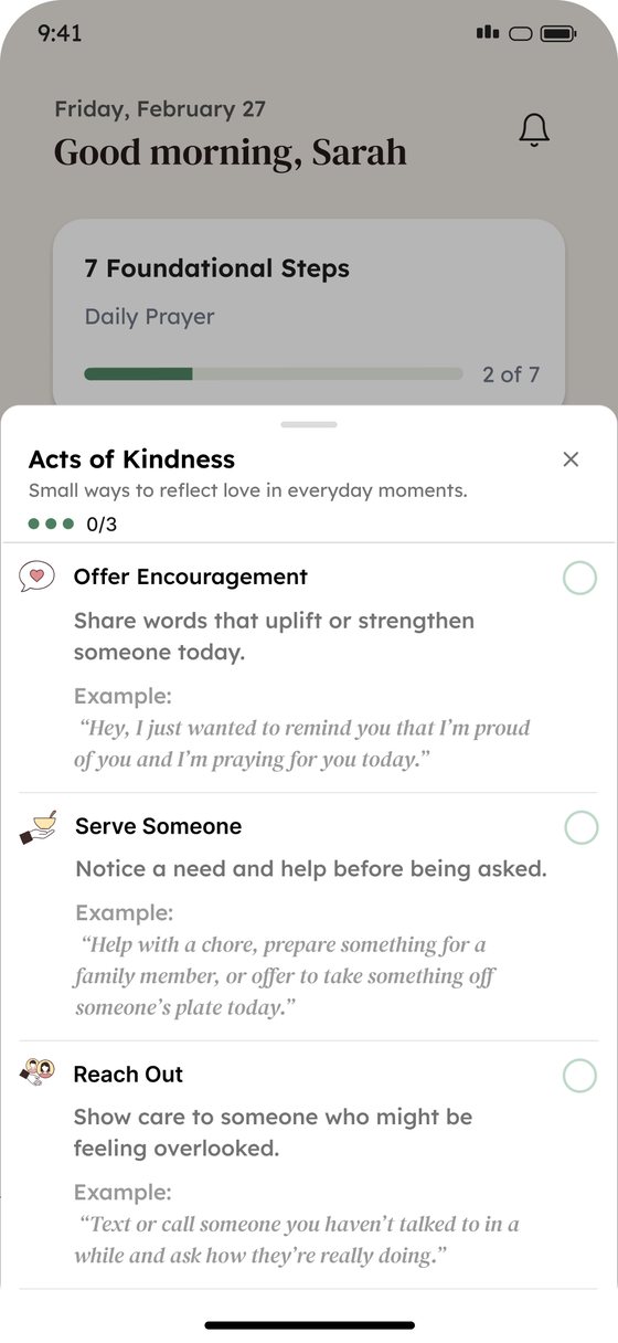
Remain brings personal and family routines into one calm app: a daily verse and chapter, guided prayer for each family member, morning and evening routines, acts of kindness, and family notes.
How might we help a whole family build daily spiritual habits together, without adding one more thing to manage?
My role
Designing for a household, not a user
Parents want structure without planning everything; kids want short, clear tasks they can feel proud of.
Rooted, growing, at home
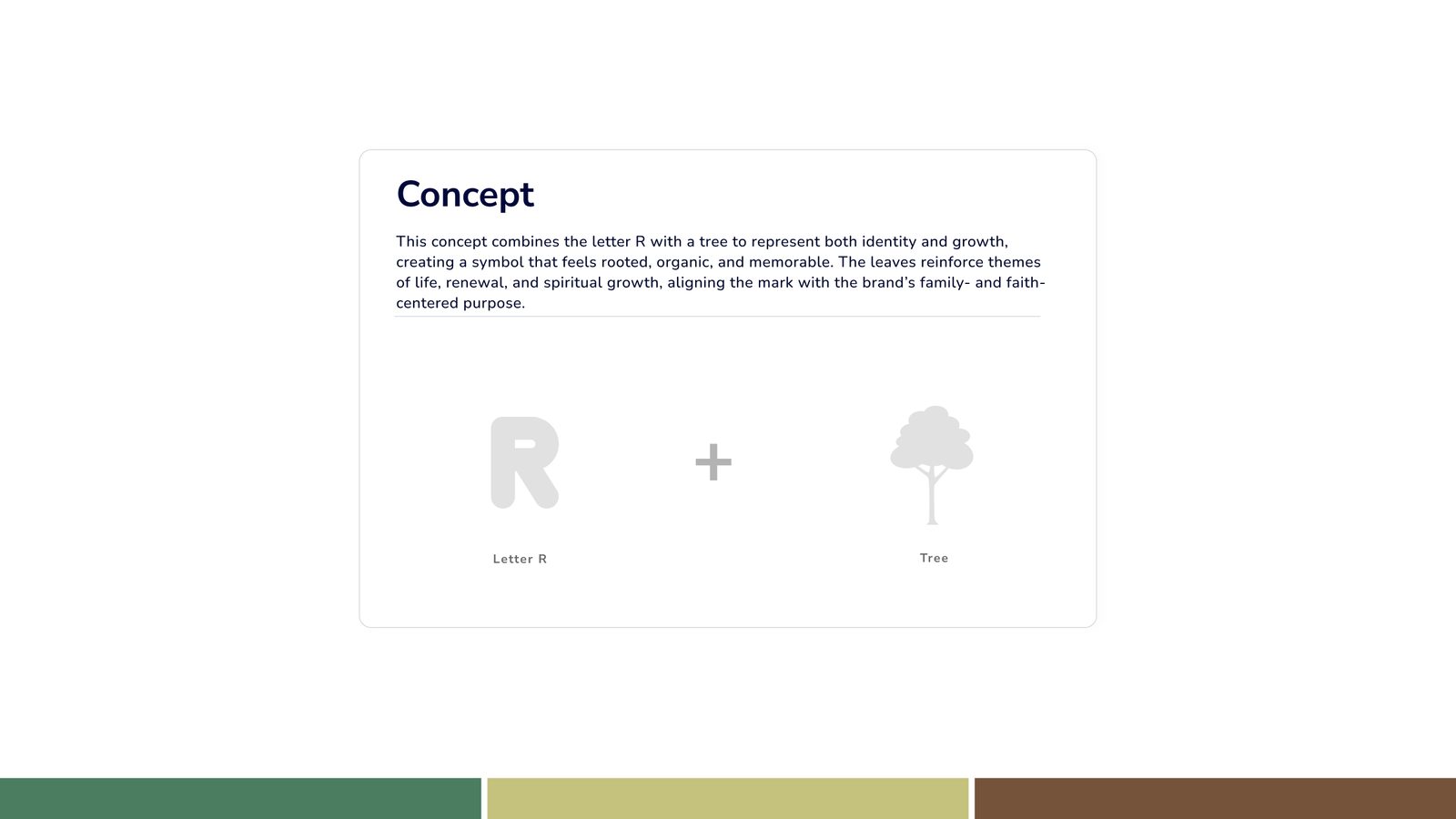
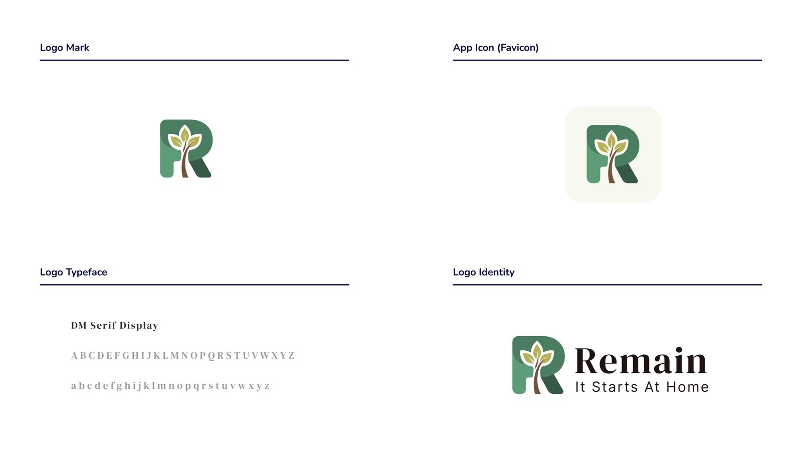
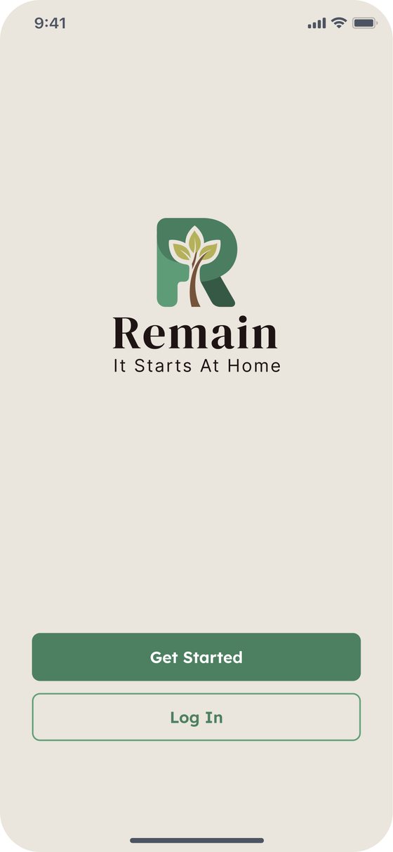
I designed the logo around one idea: the letter R grown into a tree, for identity and growth. Green, olive, and earth brown keep it organic and calm, and DM Serif Display gives it warmth. The tagline: "It Starts At Home".
Personal time and family time, side by side
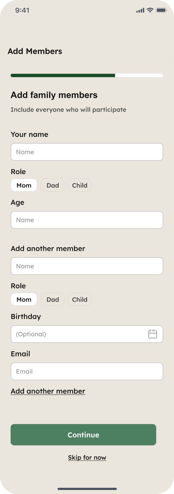
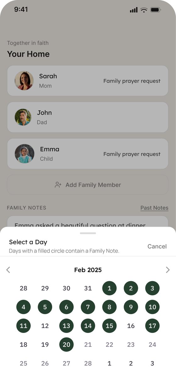
A simple switch between Personal and Family on the home screen keeps both experiences in one place, and each routine is broken into small steps with examples.
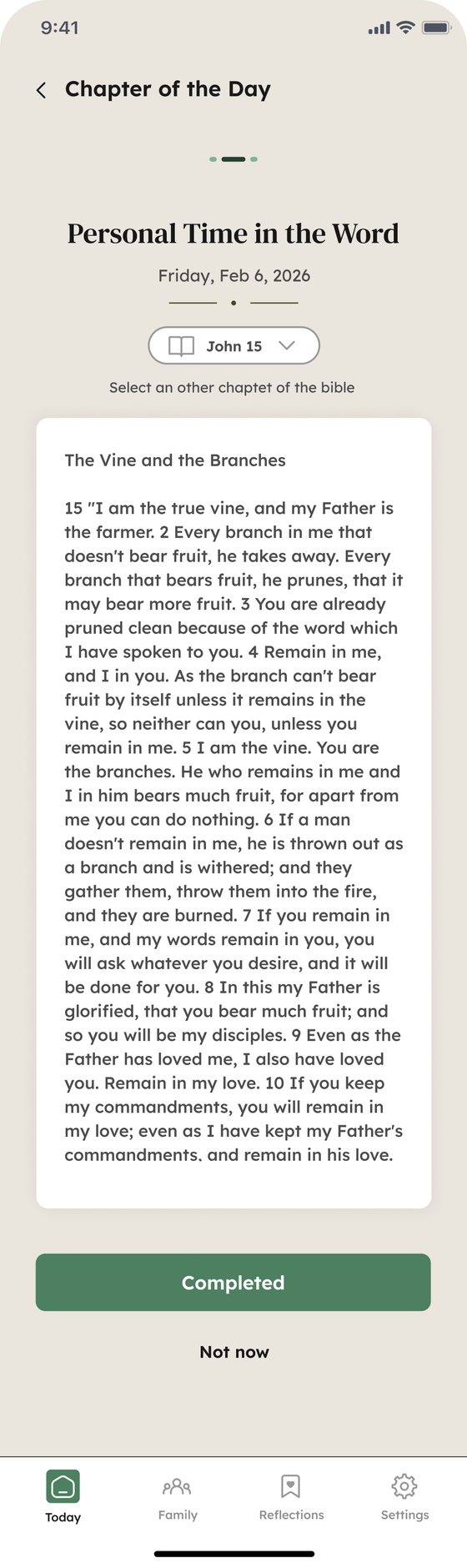
Easy to love, harder to navigate than it looked
I ran an unmoderated prototype test in Maze with 14 participants: a free exploration, 5 tasks (morning, evening, and family routines, adding a family member, and finding past family notes), and a short survey on value, usability, and pricing.
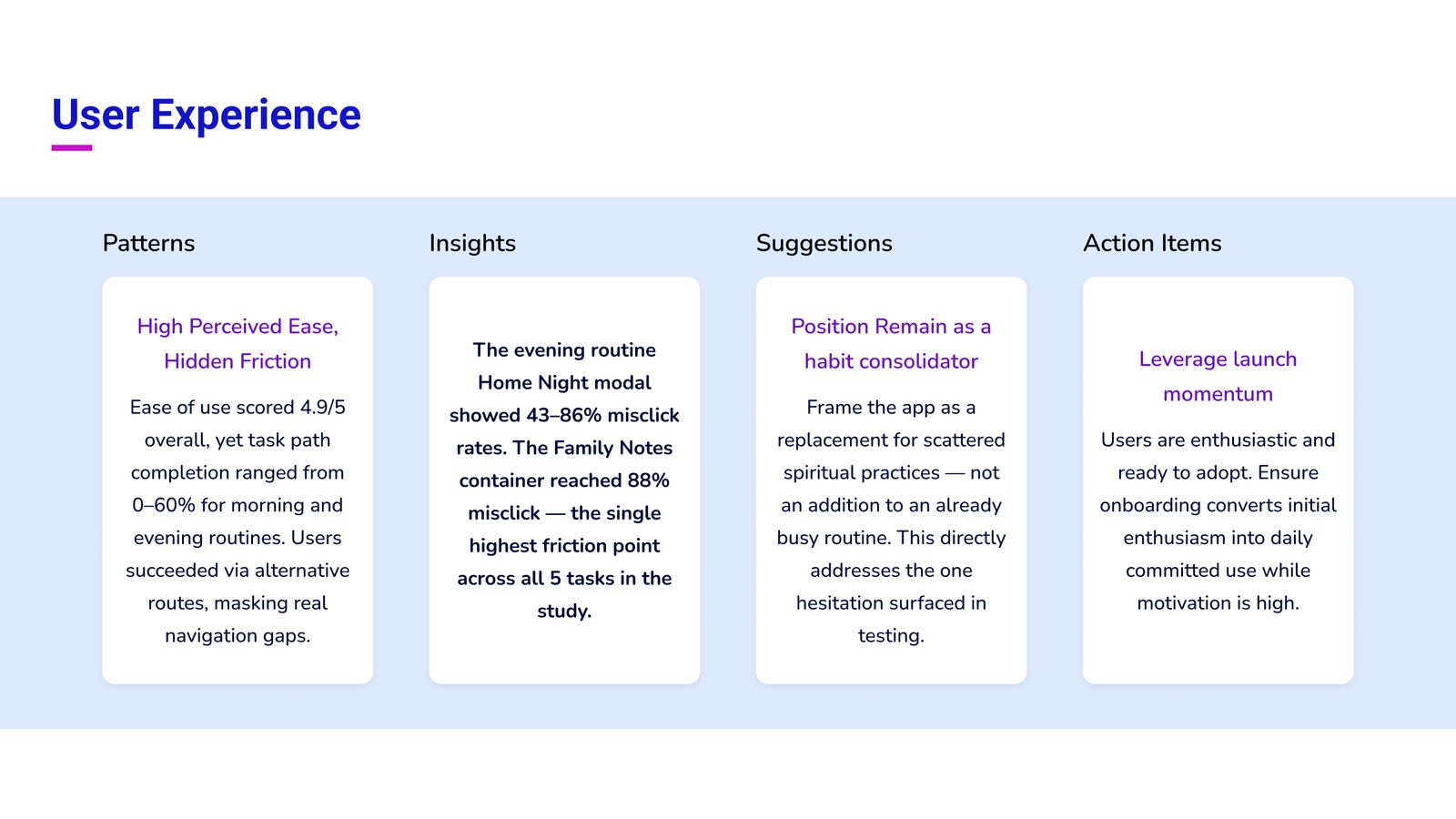
What the behavior data showed
Turning friction into the next version
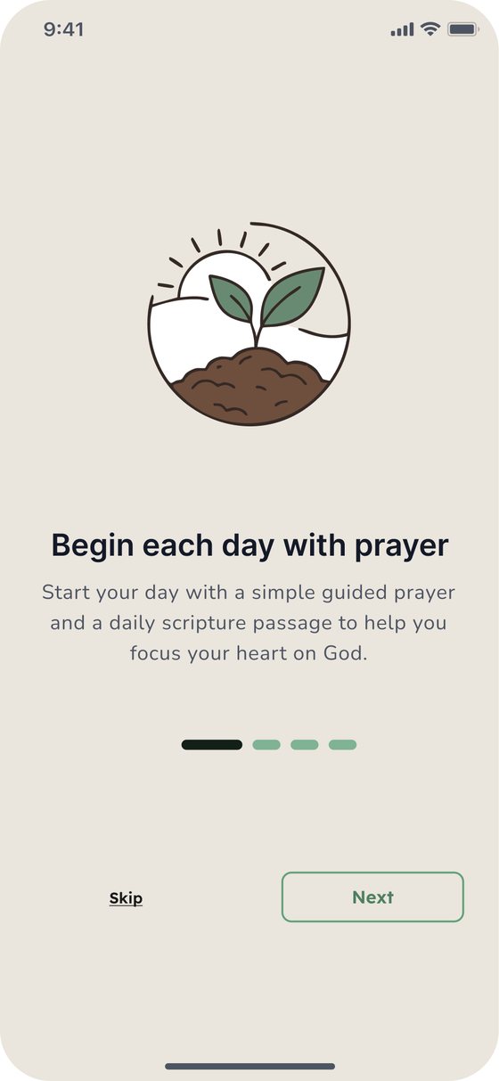
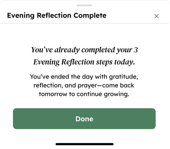
I recommended three improvements to the client: explain in onboarding how daily actions make the plants on the home screen grow, rework the evening routine and Acts of Kindness with step-by-step guidance and a confirmation on completion, and add instructions to find a different Bible chapter.
What this project taught me
Remain is the project where I owned the full loop, from Discovery to testing and back into design. The biggest lesson: what people say and what they do are two different datasets. A 4.9/5 ease score sat on top of 88% misclicks, and only the behavior data showed where to fix.
Testing isn't the end of design. It's the brief for the next version.
More case studies
Market Machines
AI trading signals people can read and trust.
View case study →Vendor Vault
Quotes, orders, and invoices for brands and suppliers.
View case study →Freight Sales Platform
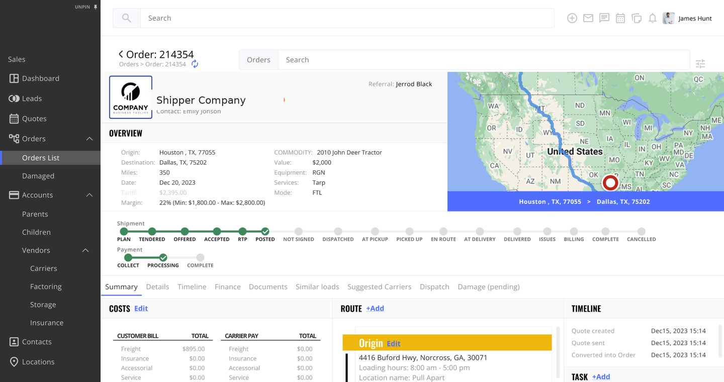
A sales-first TMS for a US freight brokerage: one place to take any load from lead to quote to signed, paid order, replacing a patchwork of tools the sales team worked around every day.
Quoting a load shouldn't take five tools
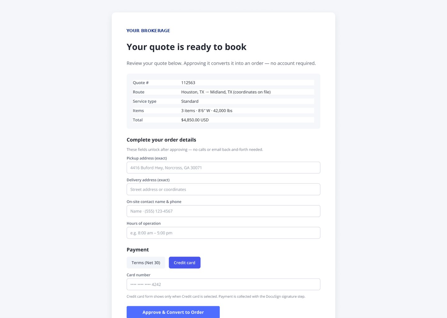
To quote a single load, the sales team jumped between an outdated TMS, Outlook, spreadsheets, and load boards. Past rates were hard to reuse, a unit mix-up (8'6" vs 8.6) could turn into a costly wide-load error, and turning a quote into a signed, paid order took days of back-and-forth.
The brokerage needed a sales-first platform: quote fast, send from the platform, and let the client convert, sign, and pay online, with the order moving to Operations automatically.
How might we take a freight load from first lead to signed, paid order in one place, without errors and without chasing other teams?
My role
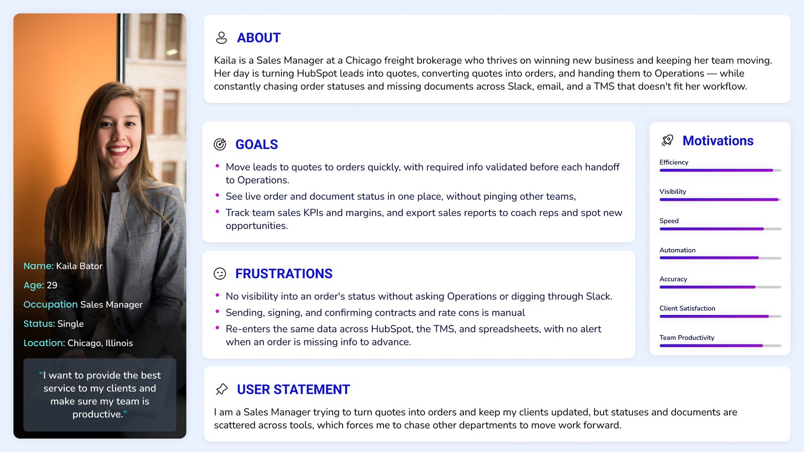
Starting from how sales actually works
What the heuristic evaluation found
A sales-first MVP
Must have
Later
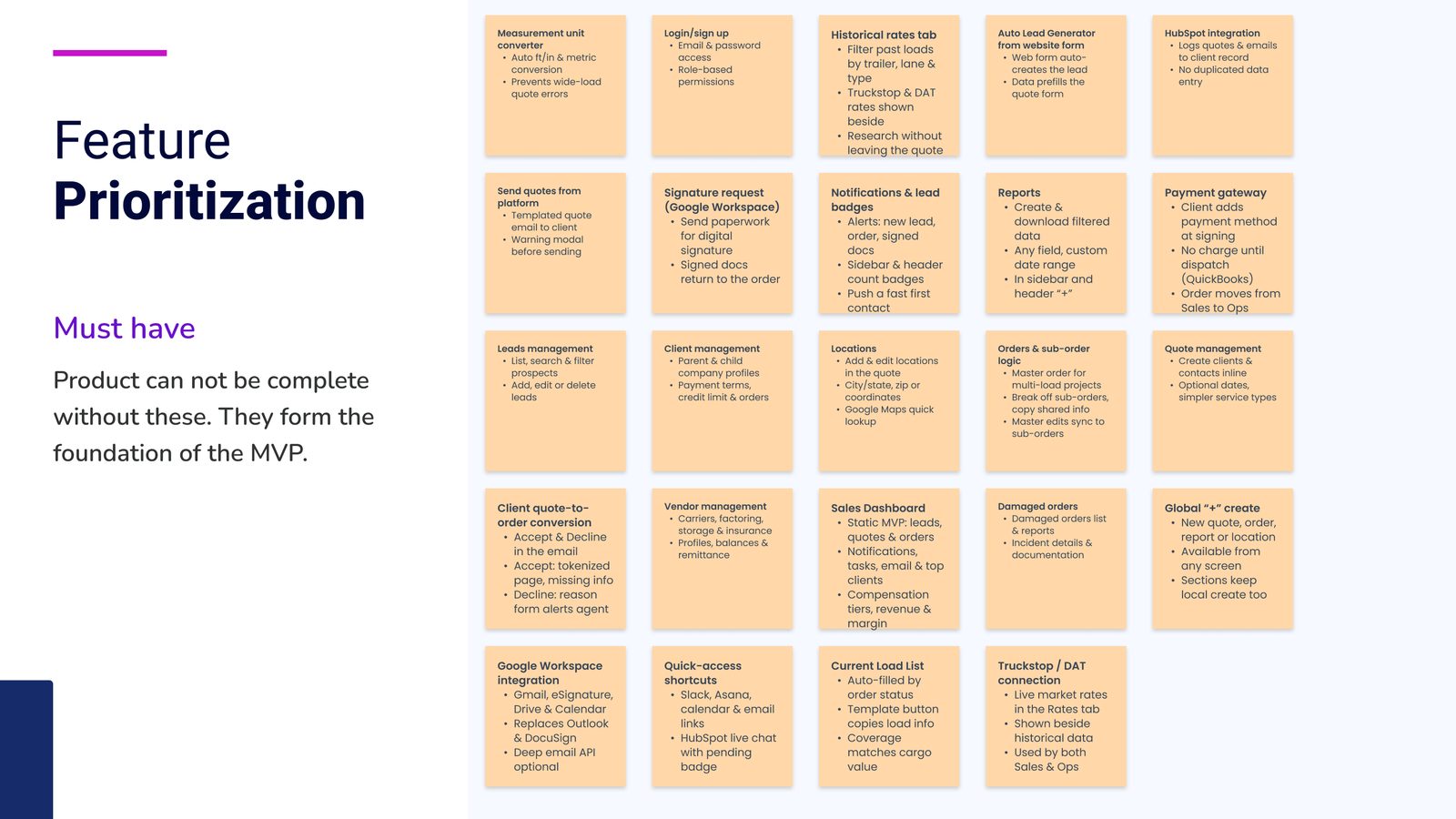

Cutting to what sales needs on day one
After the kickoff, we re-scoped the MVP around the sales team: a sales-first dashboard, quotes, and orders, with Operations and Admin views moved to later phases. Every screen was annotated with its data source, so the build team knew exactly where each field came from.
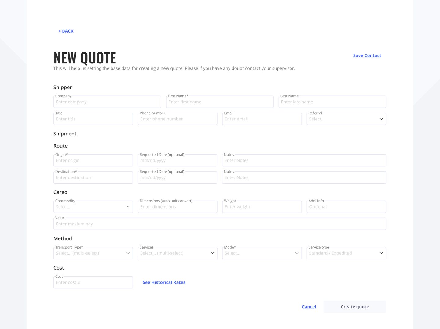
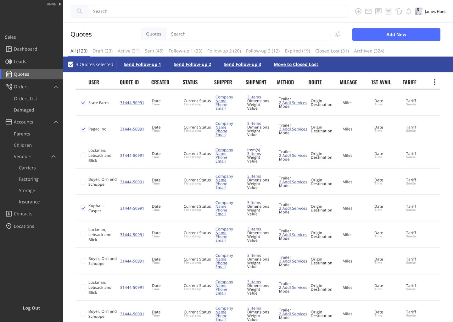
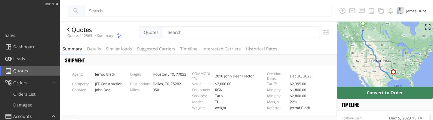
Removing the expensive mistakes
What this project taught me
Leading this Discovery as Head of Design reminded me that the fastest way to a useful MVP is a hard re-scope: one team, one job, done well, with everything else on a clear roadmap.
In operations software, good design is mostly error prevention you never notice.
More case studies
Remain
Daily spiritual habits for the whole family, tested with real users.
View case study →Market Machines
AI trading signals people can read and trust.
View case study →Align
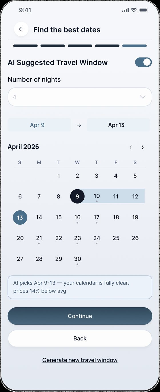
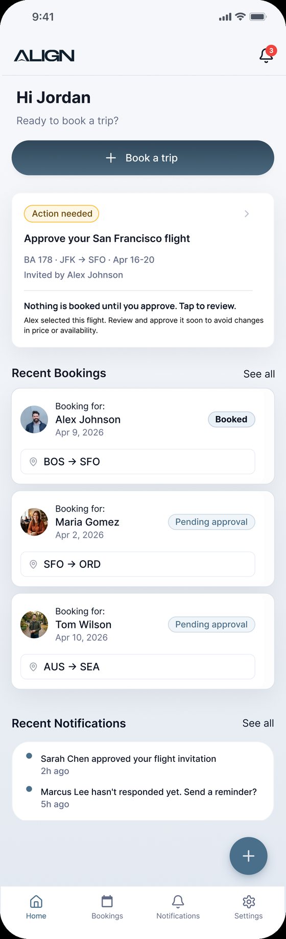
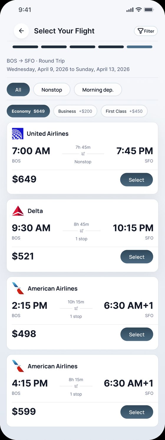
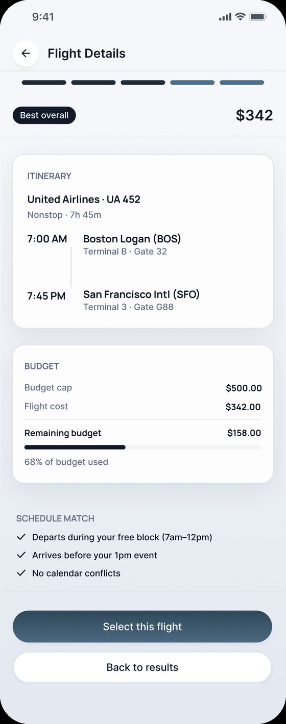
A mobile app for booking flights for someone else. It compares both calendars, suggests the best travel window and flights within budget, and nothing is booked until the traveler approves.
Booking for someone else shouldn't take a group chat
When you book a flight for a partner, a family member, or an executive, the decision depends on two calendars, preferences, and real-world constraints. A simple purchase turns into back-and-forth texts, screenshots, and guesswork, with delays and avoidable mistakes.
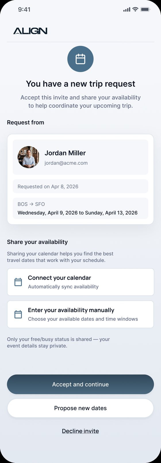
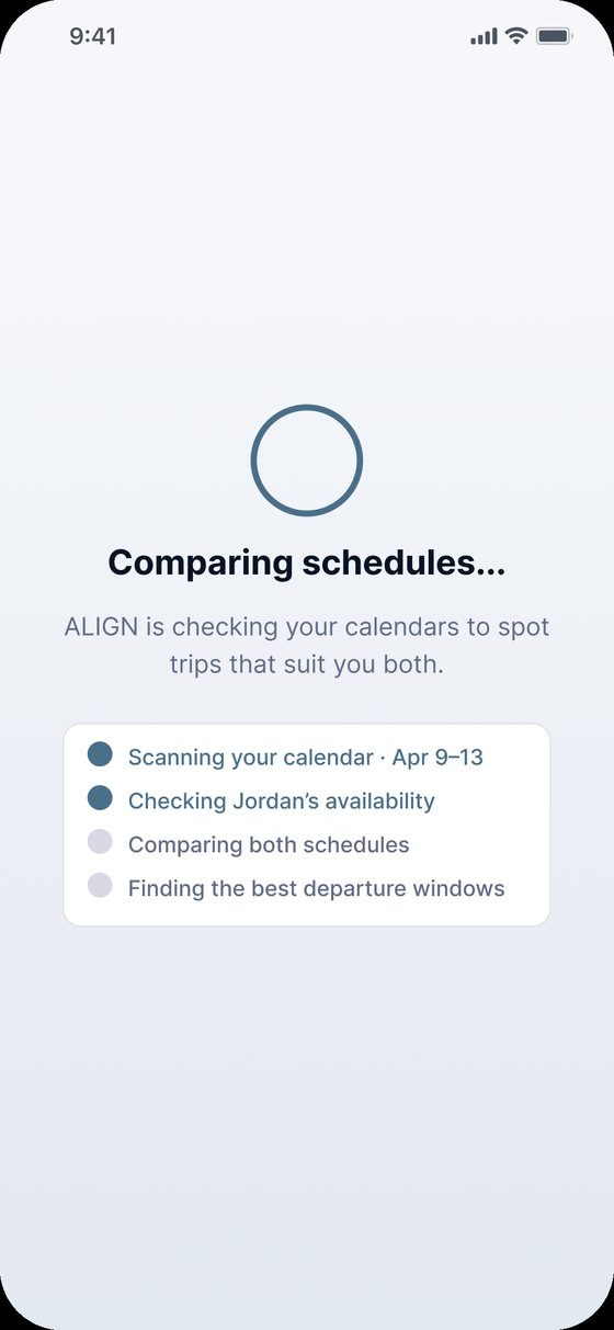
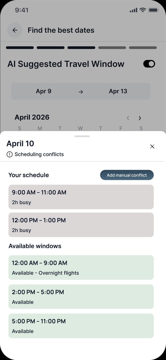
Align connects the booker and the traveler: it checks shared availability, recommends flights with clear tradeoffs, keeps the budget in view, and moves from planning to booking in one flow.
How might we turn scattered schedules and preferences into one confident, ready-to-book decision that both people agree on?
My role
Three people who book, and one who has to show up
Daniel wants to know which flight works for both people and book it. Emily wants the flight to fit her classes and exams, and to understand why it was chosen. Olivia books for a CEO across calendars and time zones, and needs speed without mistakes.
What the journeys showed
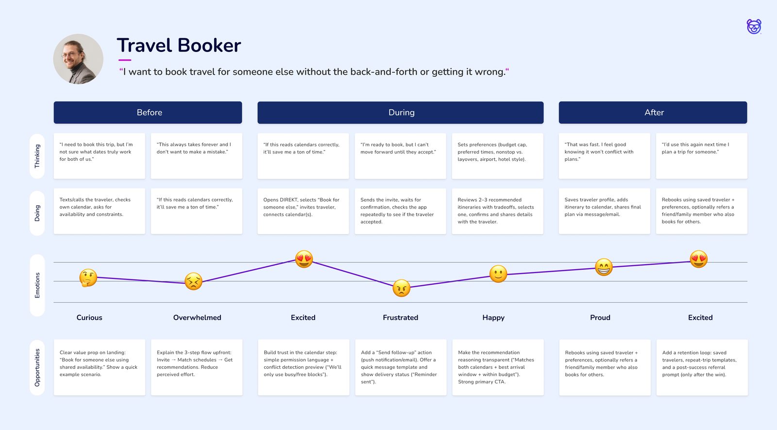
An MVP built around one decision
Must have
Planned for V2
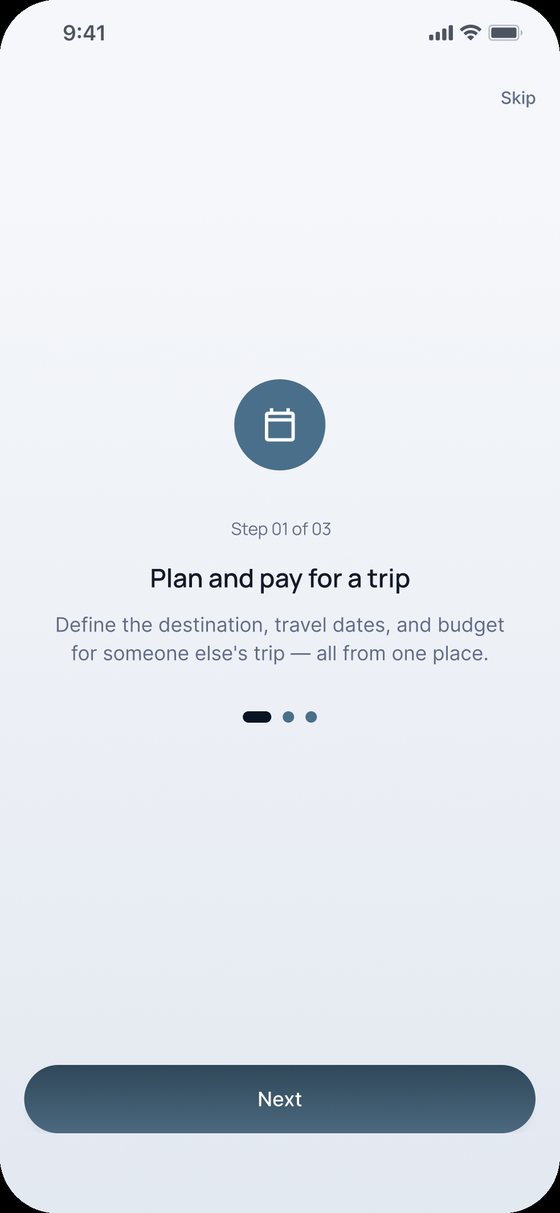
The outcome: a mobile app of about 23 screens focused on trip setup, calendar availability, AI flight suggestions, approvals, bookings, and payment.
Structure first, then personality
I designed the wireframes in grayscale to settle structure and flow with the client, then carried the same layouts into a calm slate-blue UI.
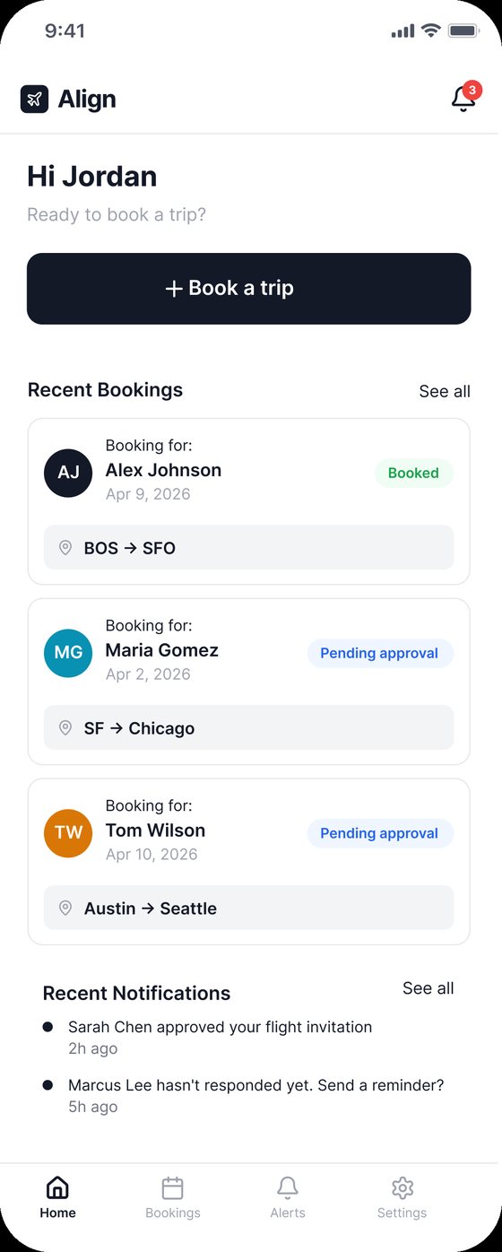
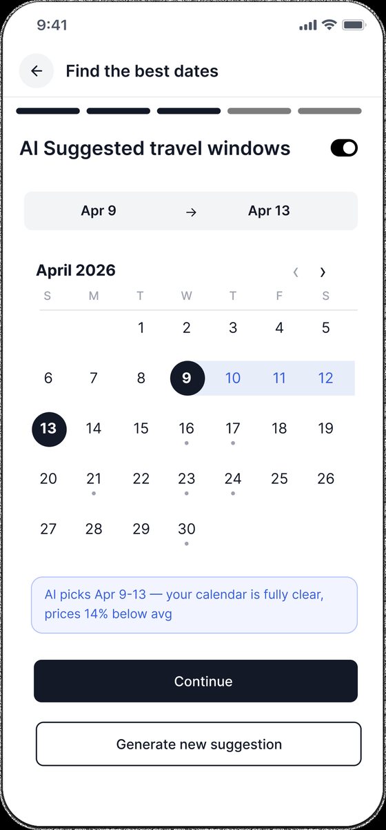
From an invite to a confirmed booking
Invite and match schedules
Choose, review, book
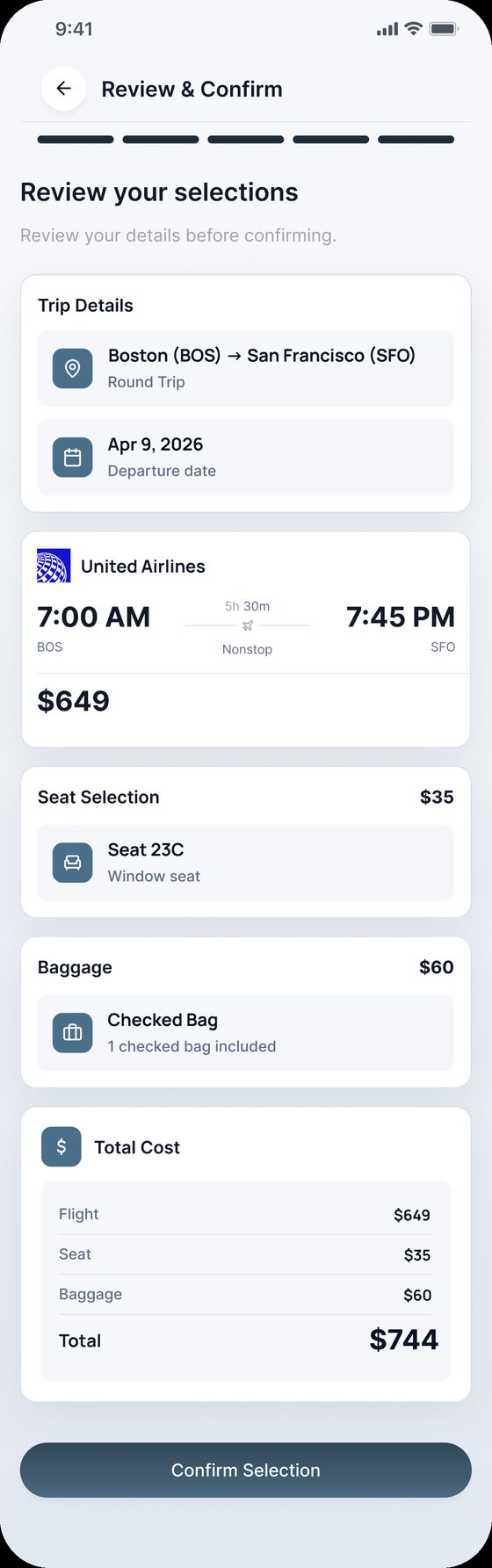
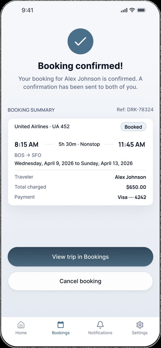
Designing for trust between two people
What this project taught me
Align is a scheduling problem disguised as a travel app. Taking it from Discovery to prototype showed me that the hardest part of shared decisions is trust: privacy you can see, reasons you can read, and a clear moment where the other person says yes.
When two people decide together, the interface has to speak to both of them.
More case studies
Freight Sales Platform
Lead to signed, paid order in one sales-first TMS.
View case study →Remain
Daily spiritual habits for the whole family, tested with real users.
View case study →SerenityMate
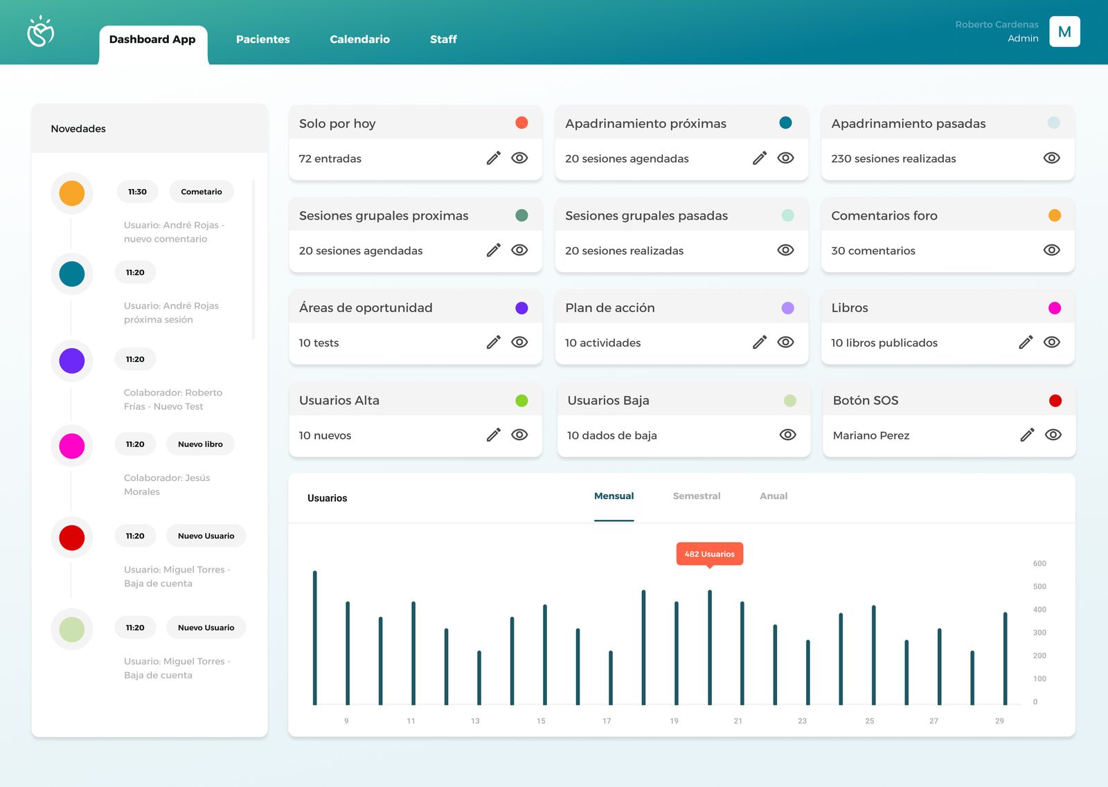
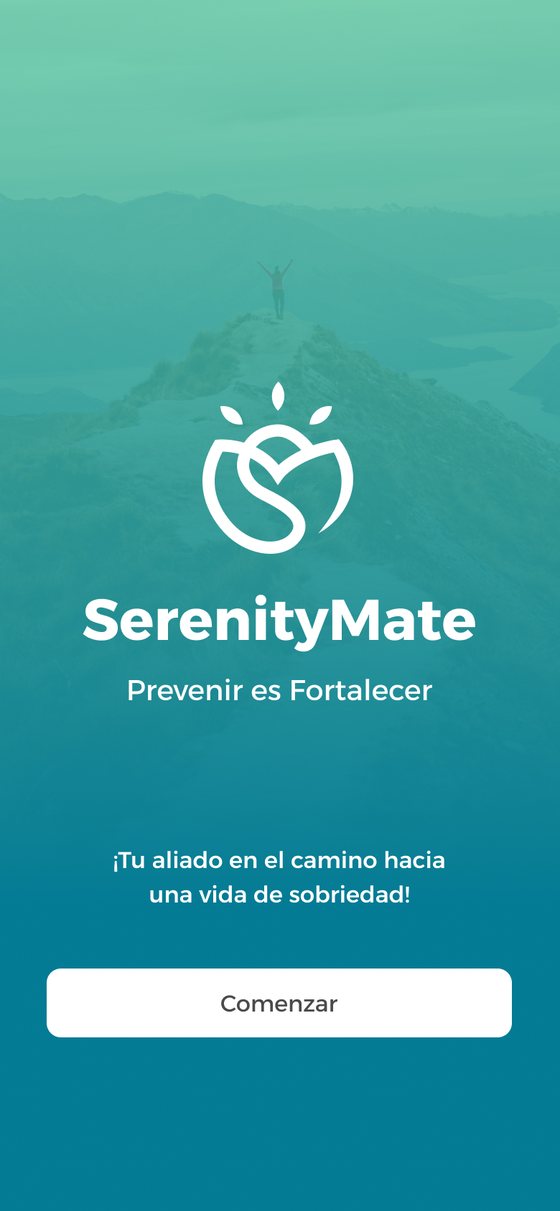
A dual-platform product designed to reduce post-treatment relapse rates in addiction recovery, combining a patient-facing mobile app with a clinical management dashboard for rehabilitation professionals.
The problem worth solving
Relapse rates among addiction recovery patients remain critically high, not because treatment fails, but because support drops off the moment patients leave the clinic.
SerenityMate addresses both sides of this gap: a mobile app that keeps patients supported between sessions, and a web-based management platform for healthcare professionals.
How might we provide continuous support to individuals in addiction recovery while giving clinics tools to proactively manage patient outcomes?
Starting with the people, not the product
Methods
Key findings
Four people, two products
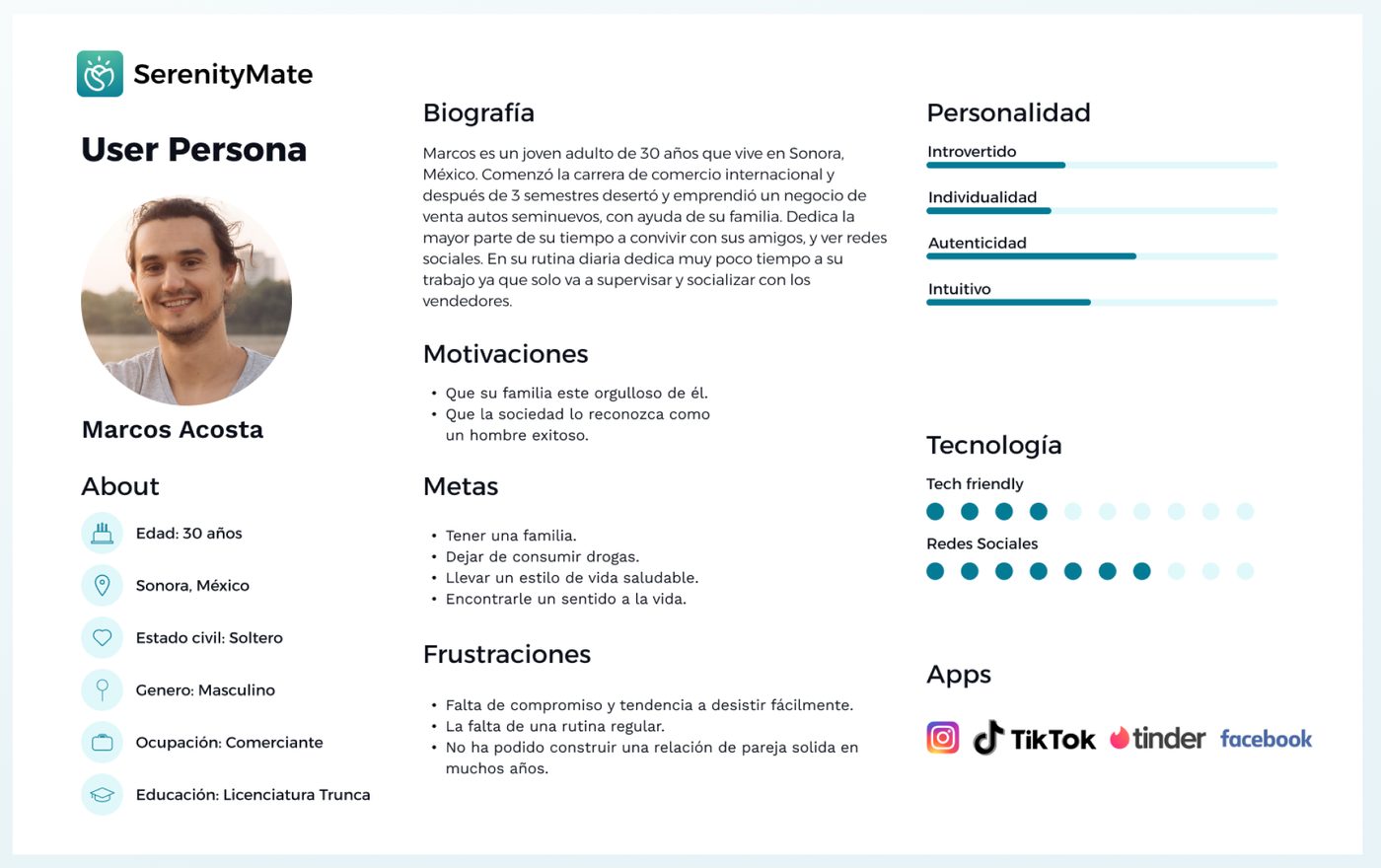
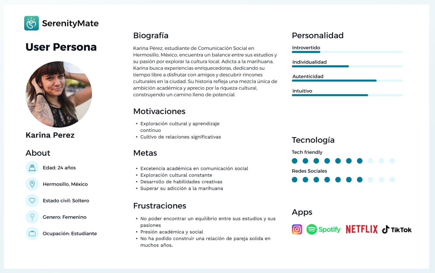
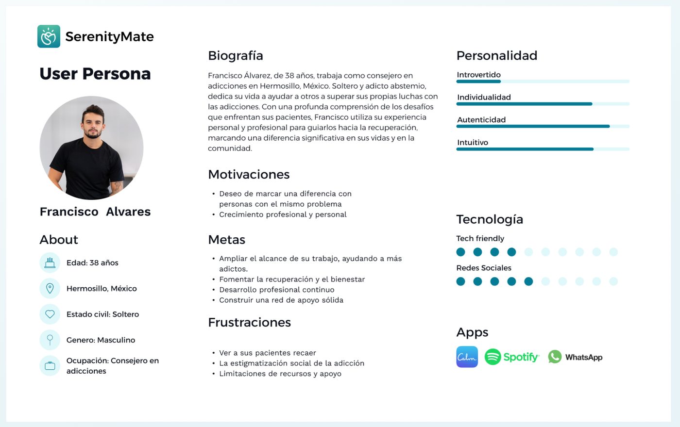
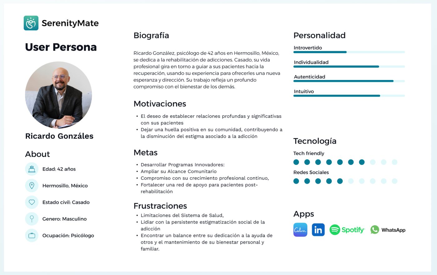
Research and personas were produced in Spanish with patients and clinicians in Mexico.
From structure to high-fidelity
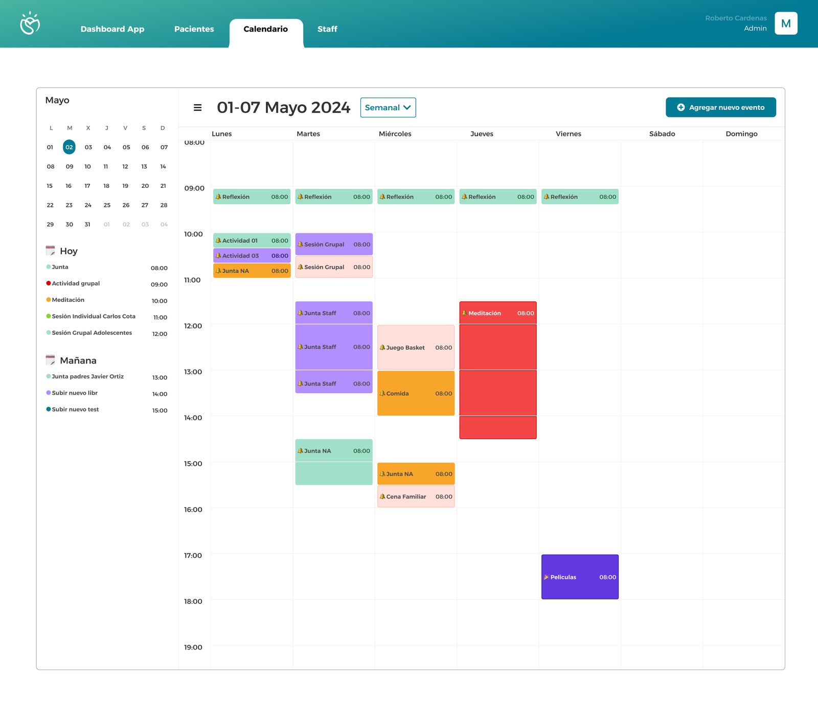
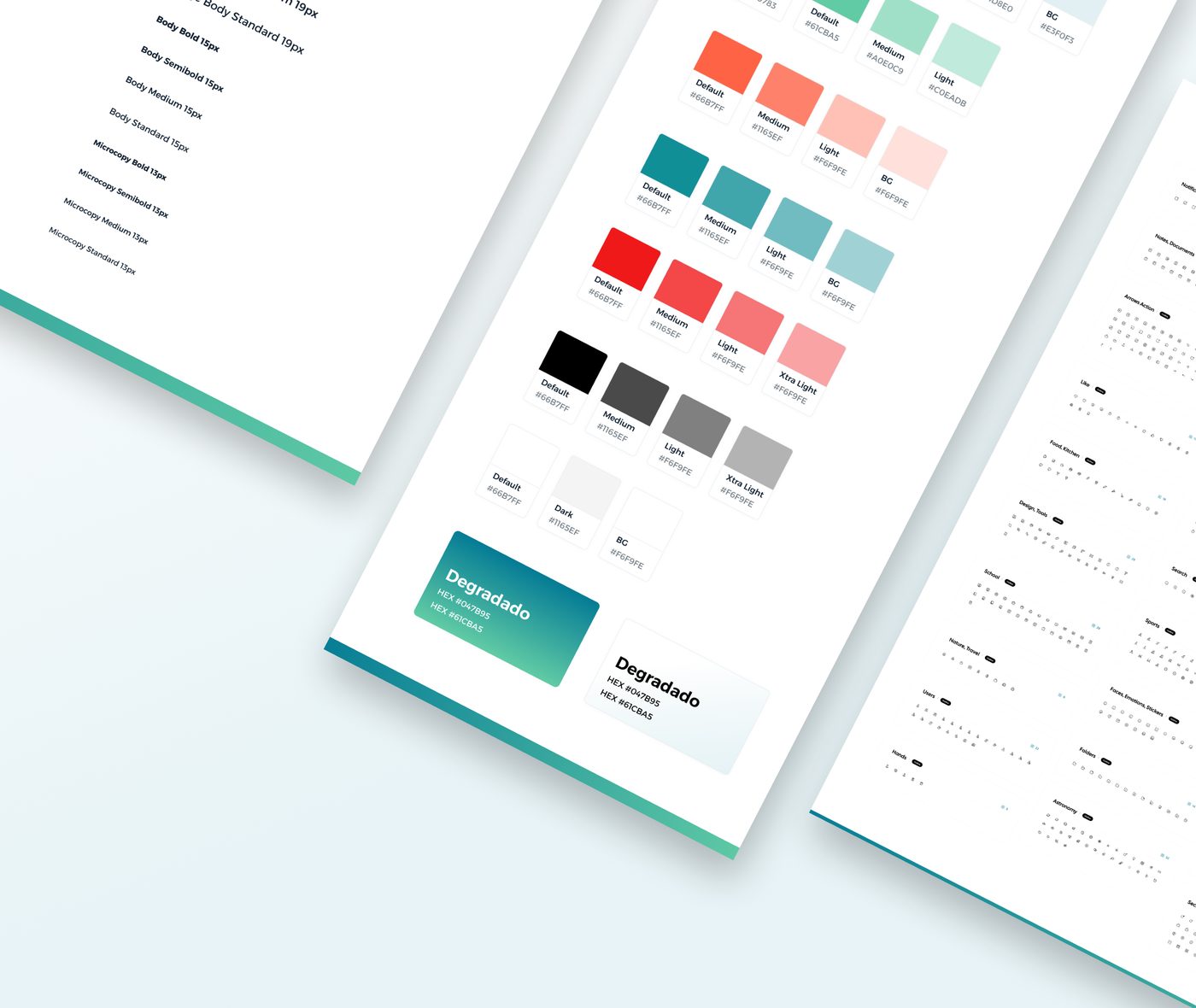
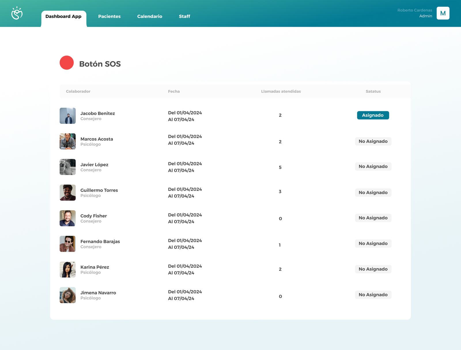
Over 70 wireframes covering both the mobile app and management dashboard, prioritizing intuitive navigation and frictionless access.
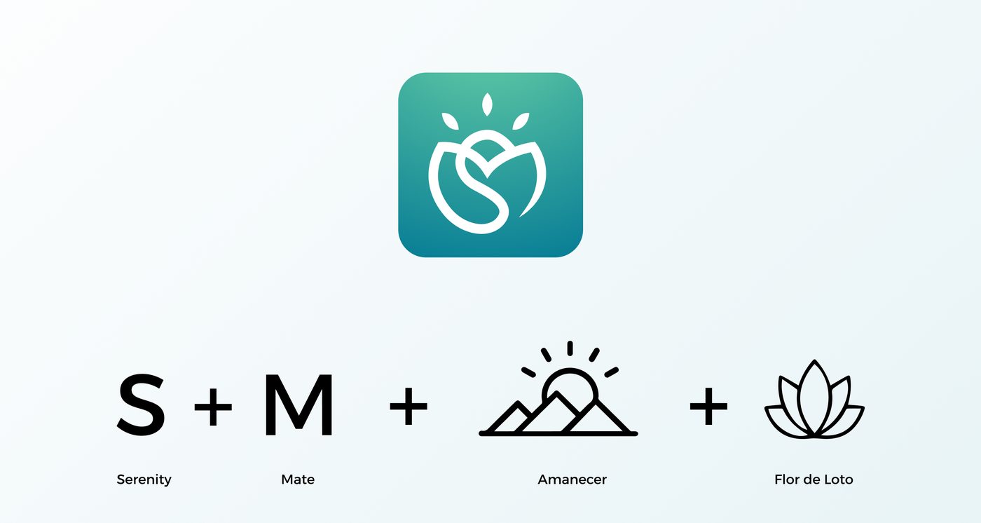
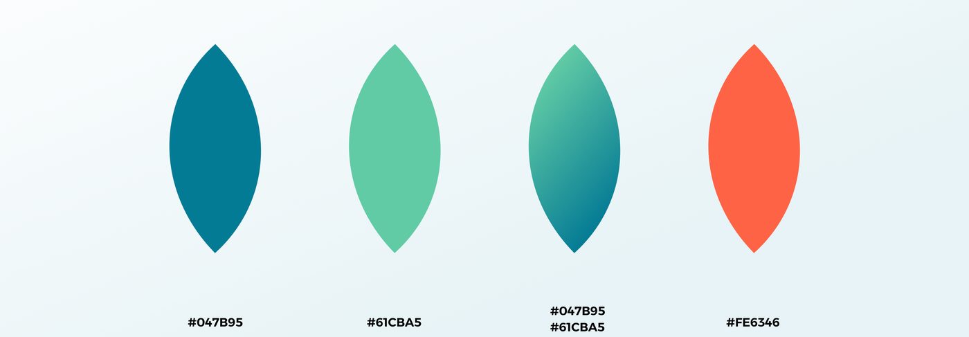
Brand
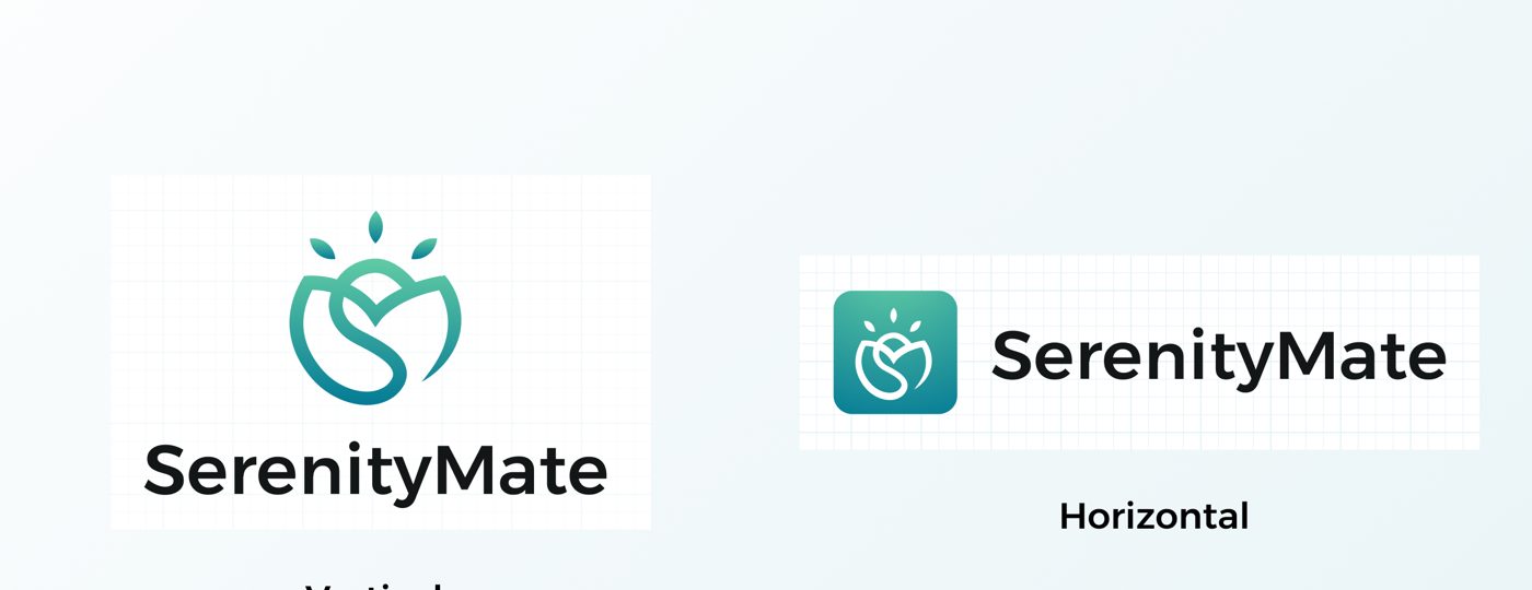
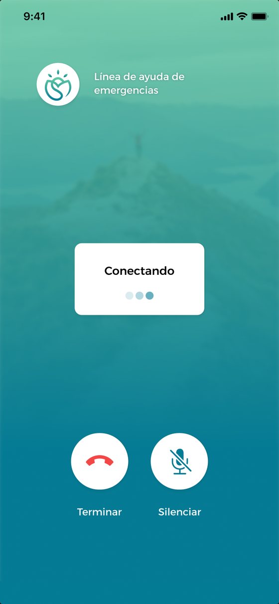
Mobile app
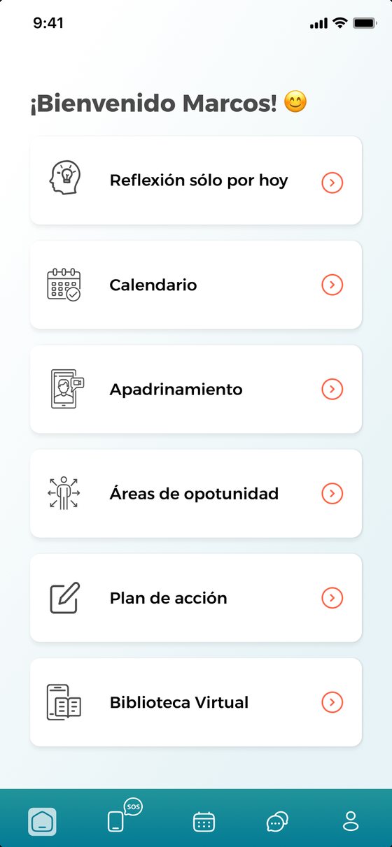
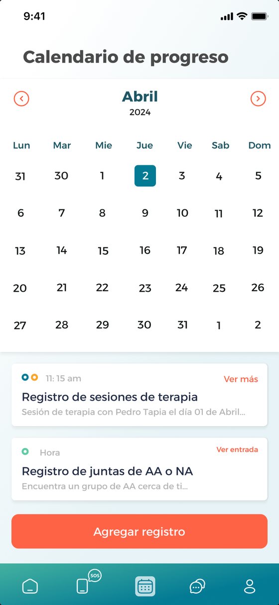

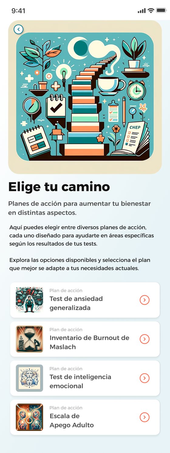
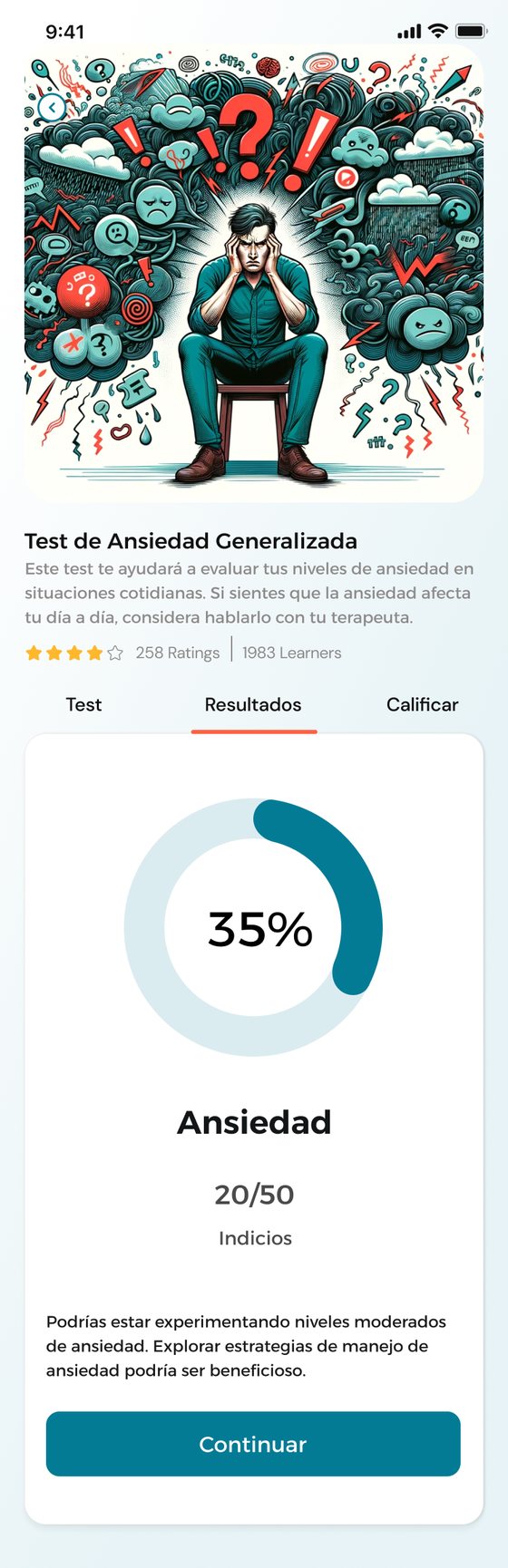
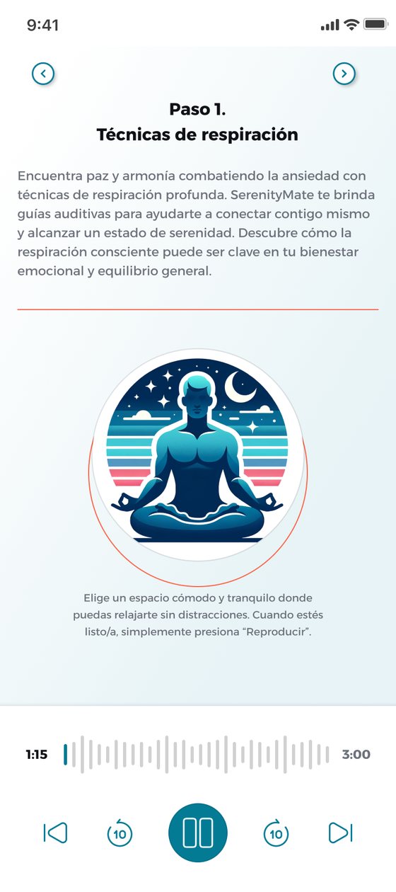
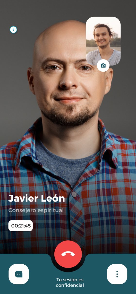
Clinic platform
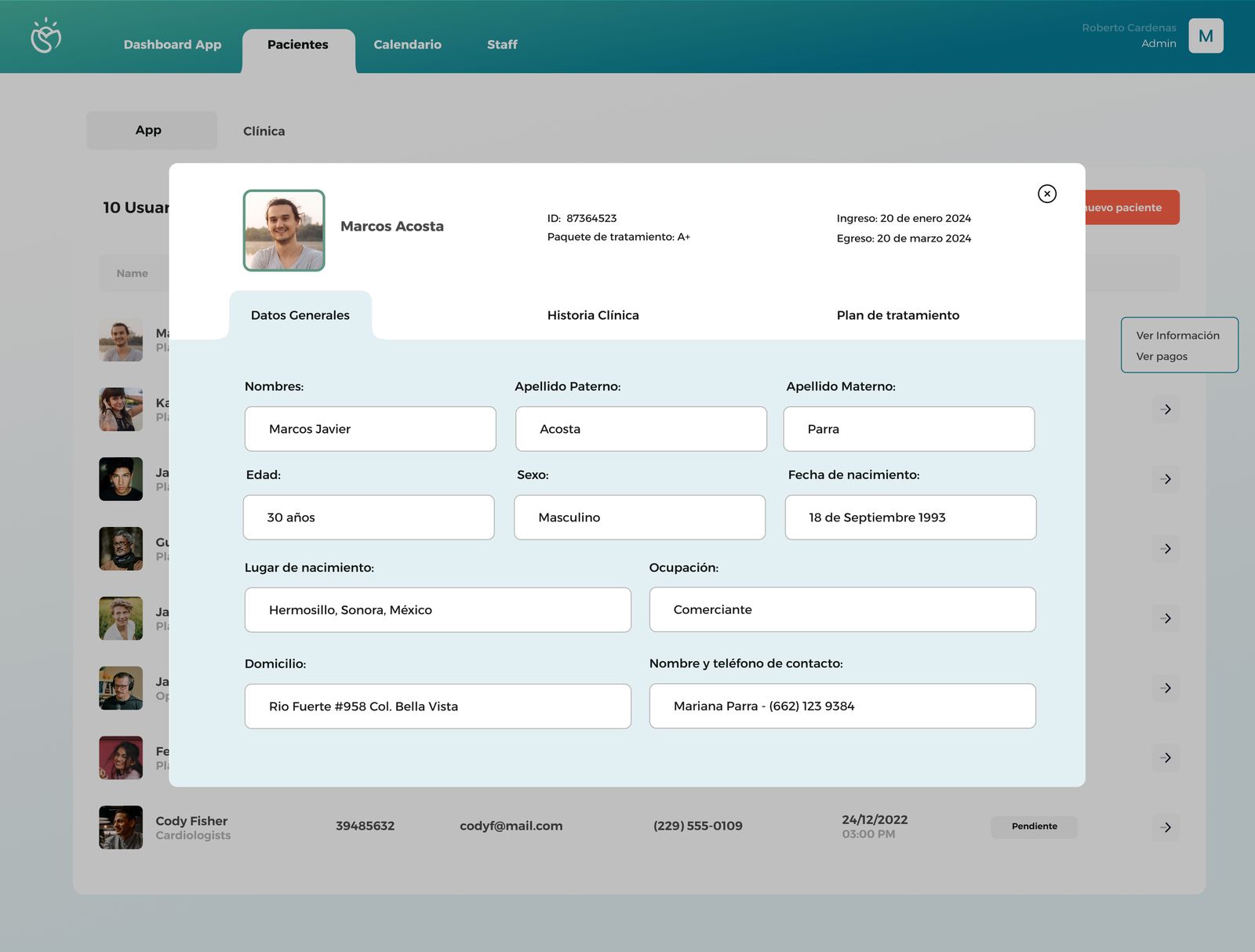
Turning research into product decisions
Key decisions
What this project taught me
SerenityMate was one of the most complex end-to-end projects I've taken on, spanning field research at a rehab clinic, brand creation, two distinct product surfaces, and a business model. It reinforced that the most impactful UX work happens at the intersection of deep user empathy and strategic thinking.
The most important design decision wasn't a screen. It was the decision to treat the app as a companion, not a tool.
More case studies
Align
Book flights for someone else, with both calendars in sync.
View case study →Freight Sales Platform
Lead to signed, paid order in one sales-first TMS.
View case study →Market Machines
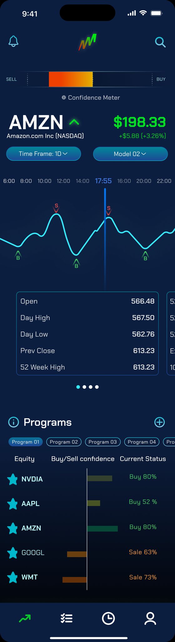
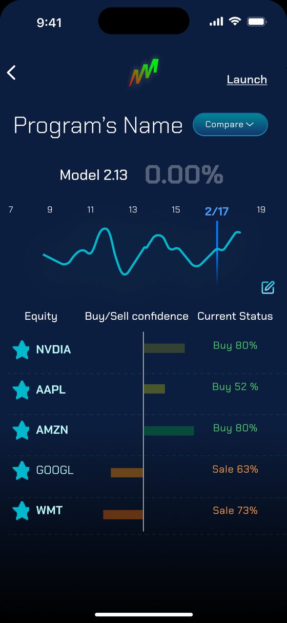
A mobile app that turns Market Machines' AI models into clear buy and sell signals: build programs around the stocks you follow, test them against historical data, and get alerted when the algorithms change their minds.
Making AI trading signals readable
Market Machines tracks algorithmic sentiment in the stock market with its own AI models. The client needed a mobile app that let traders follow those models for the companies they care about and act on buy and sell signals with more confidence.
Trades happen outside the app. Market Machines is the decision-support layer, so every screen had to make a model's signal, and how sure it is, easy to read at a glance.
How might we help traders trust AI-generated signals without hiding the uncertainty behind them?
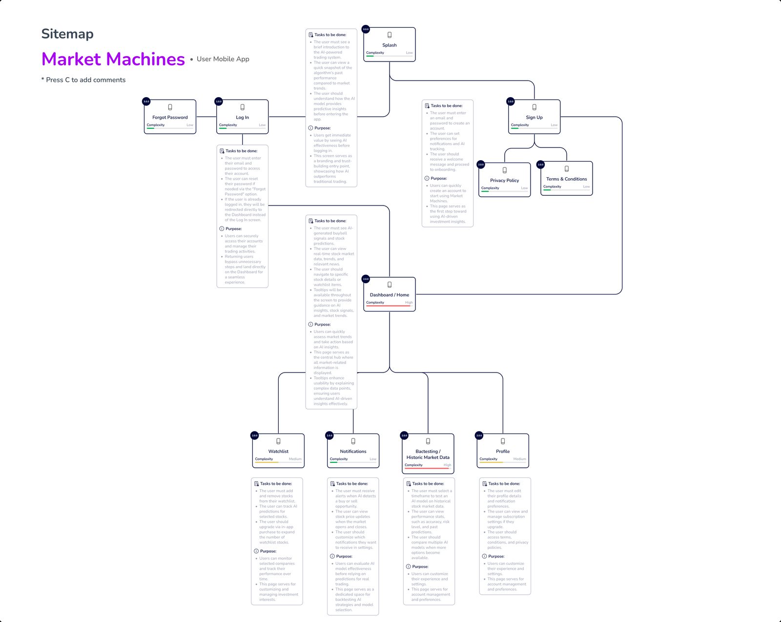
Defining the product before designing it
What the benchmark told us
An active trader first, a new investor next
Daniel trades daily and wants data-backed signals to cut emotional, impulsive trades. Laura wants to start trading without feeling overwhelmed, which pointed to the educational features we parked for V2.
A focused MVP, with a clear V2
Must have
Could have
Planned for V2
From a watchlist to programs
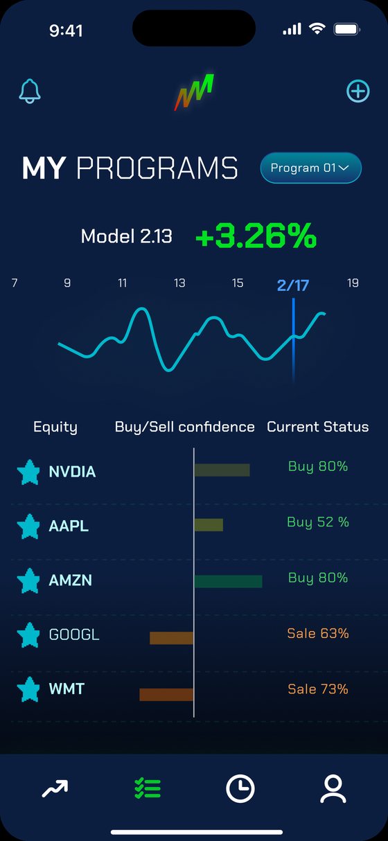
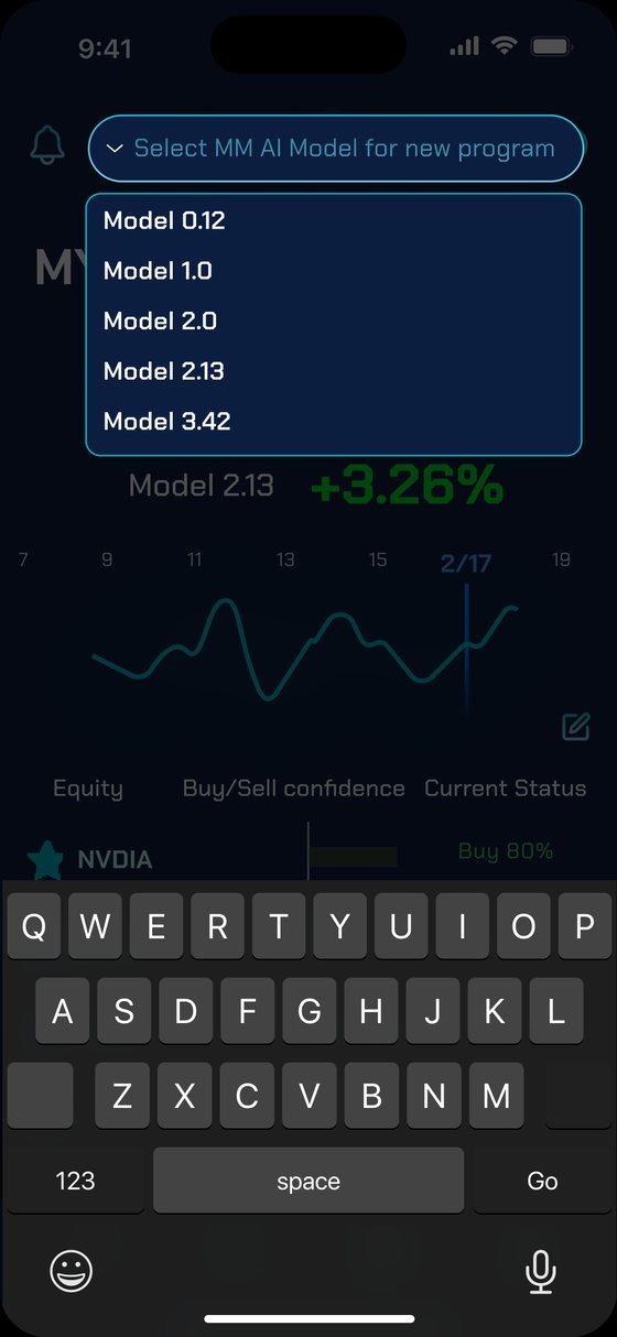
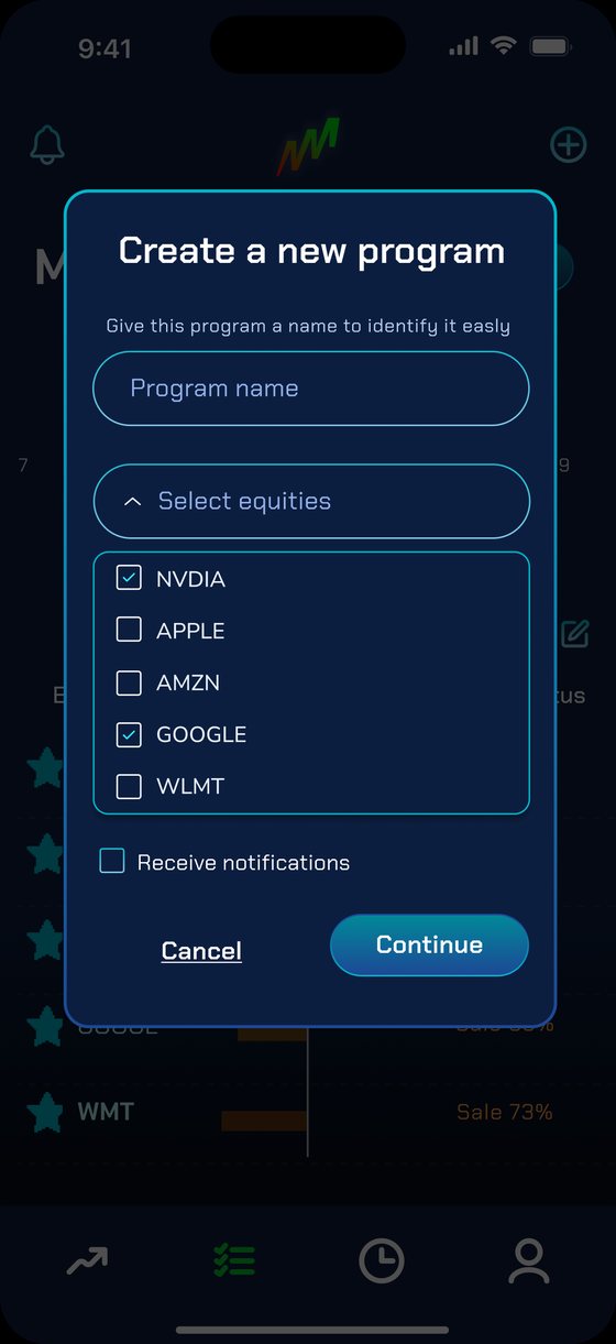
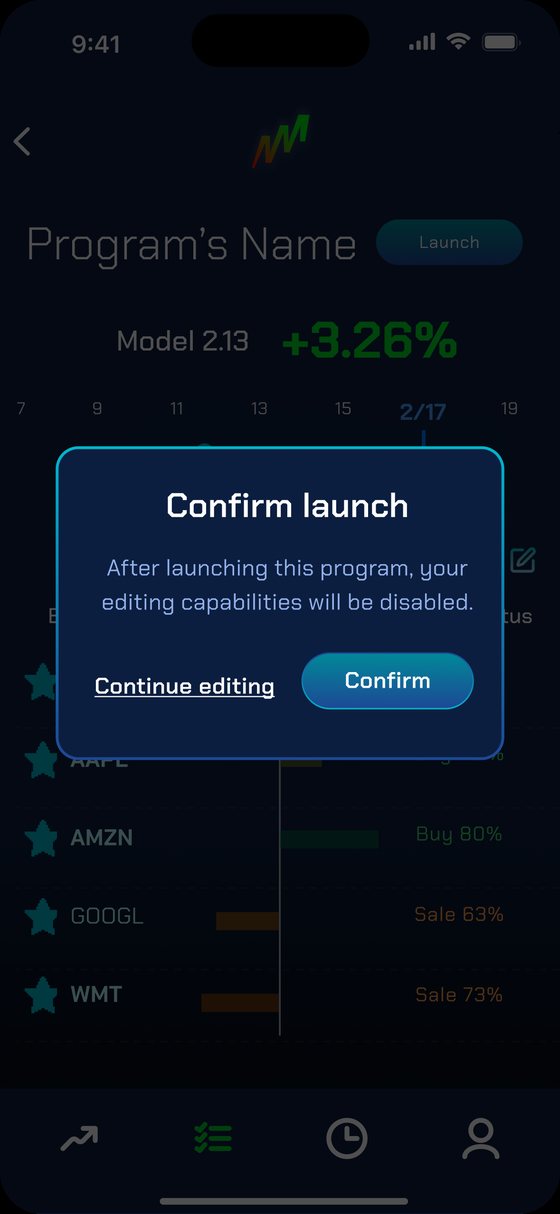
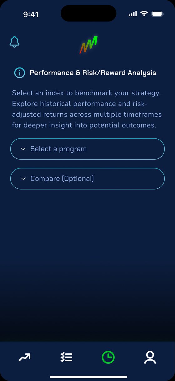
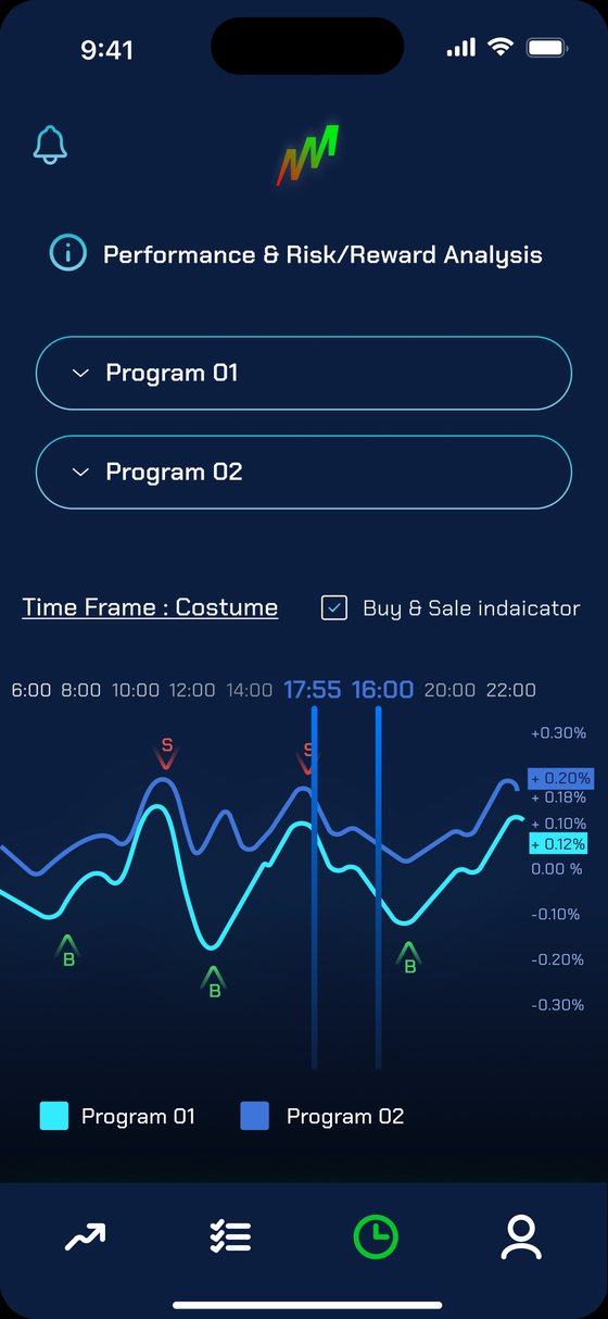
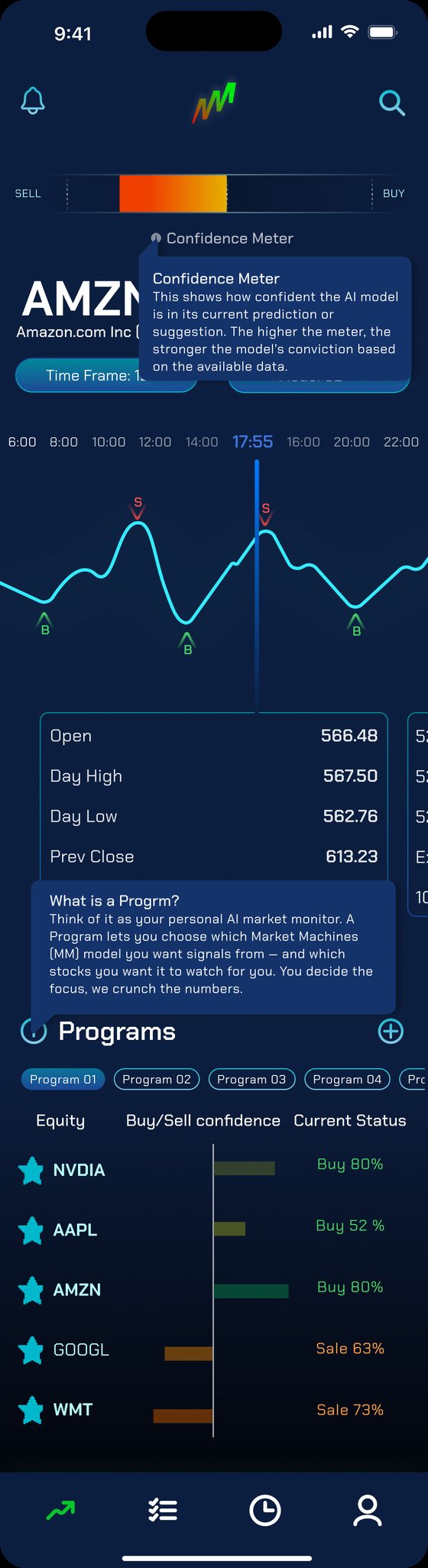
In the UI phase the watchlist grew into Programs: the user picks a Market Machines model, chooses the equities to follow, and gets that model's signals for each one. A dark, high-contrast interface keeps charts and signal colors legible.
Test before launching
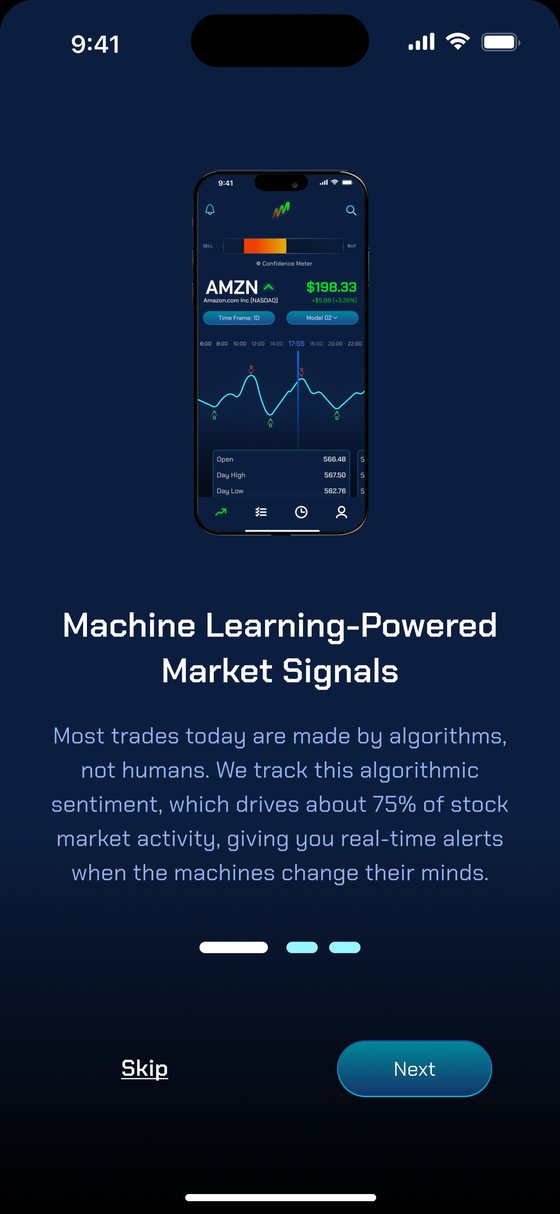
Onboarding and alerts
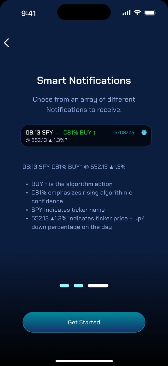
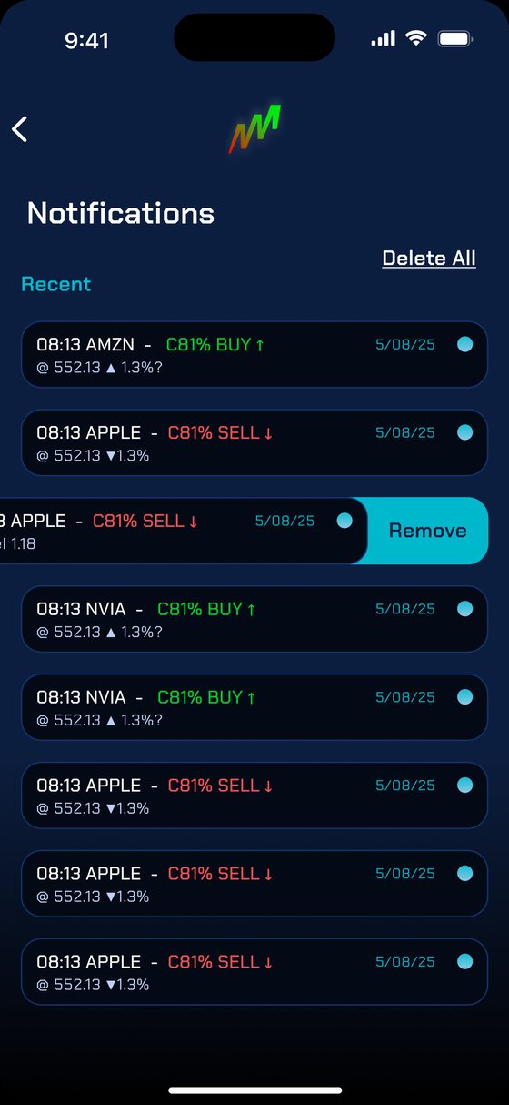
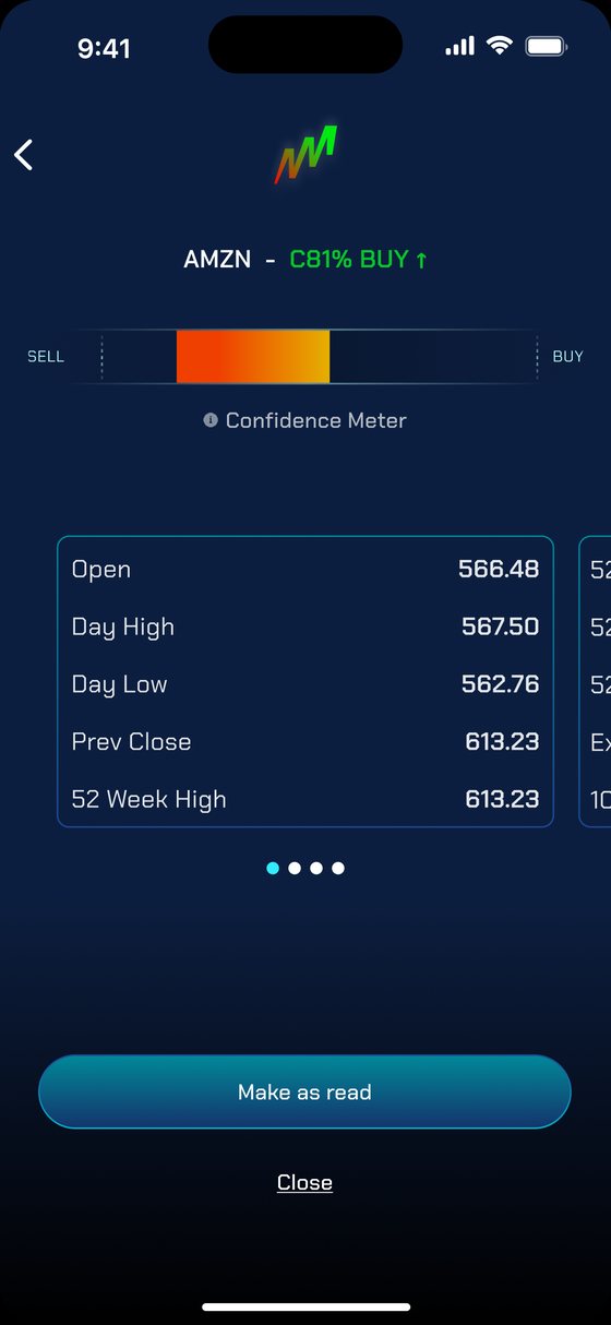
Designing for trust in an AI product
What this project taught me
Designing for AI in finance taught me that trust isn't a tone, it's a structural property of the interface: showing confidence, explaining terms in place, and letting people test before they commit.
In AI products, users don't trust the algorithm. They trust the interface that surrounds it.
More case studies
Vendor Vault
Quotes, orders, and invoices for brands and suppliers.
View case study →SerenityMate
Recovery companion app and clinic platform.
View case study →Vendor Vault
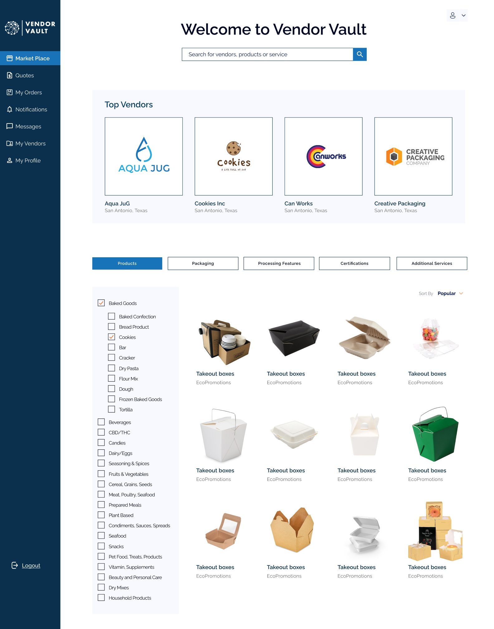
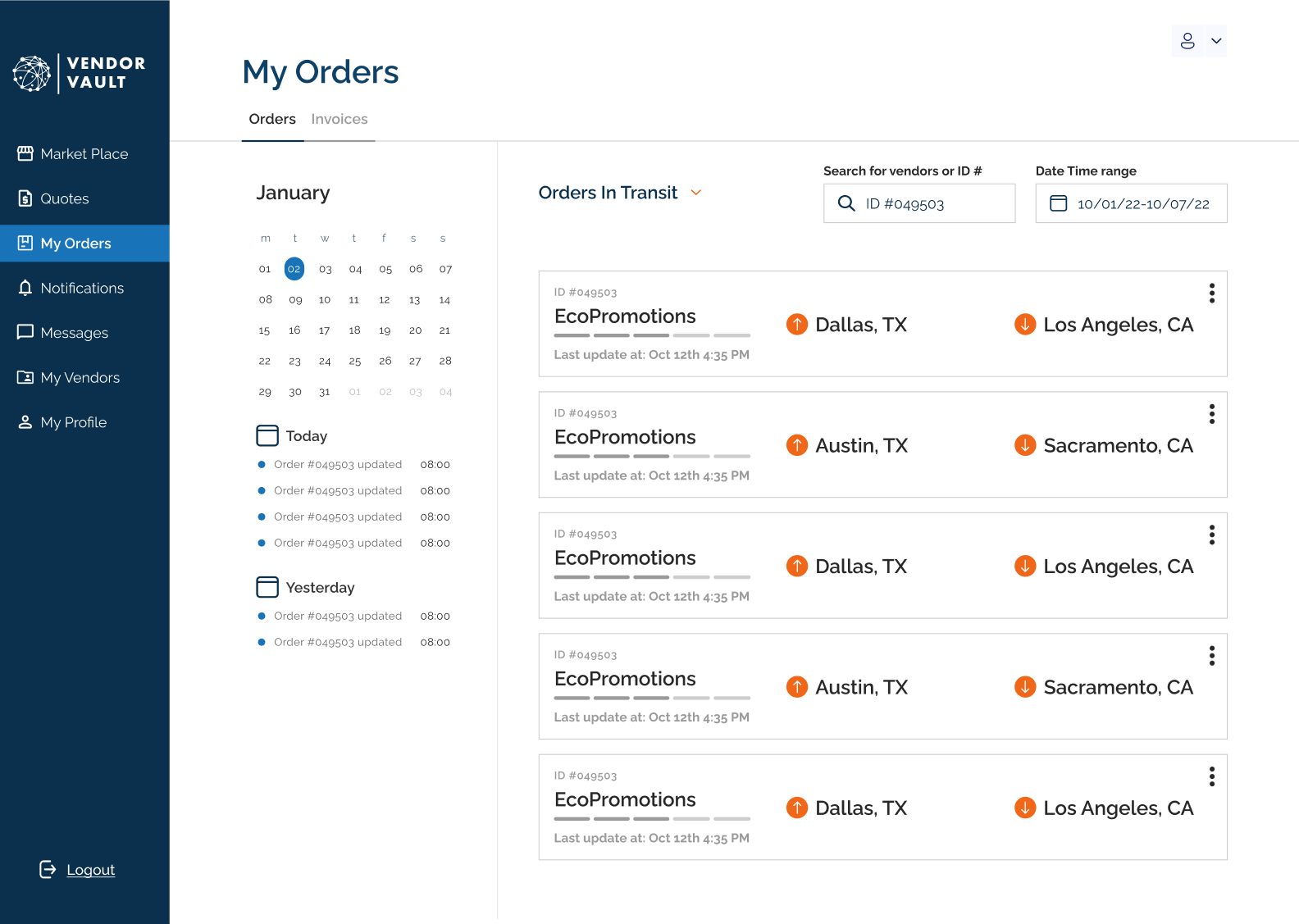
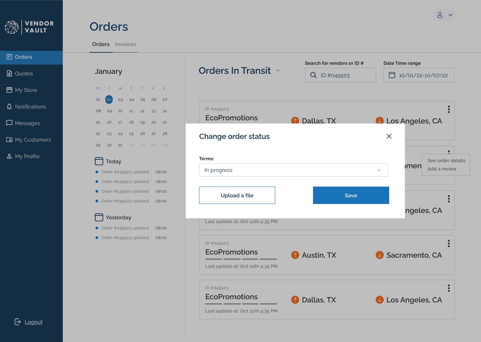
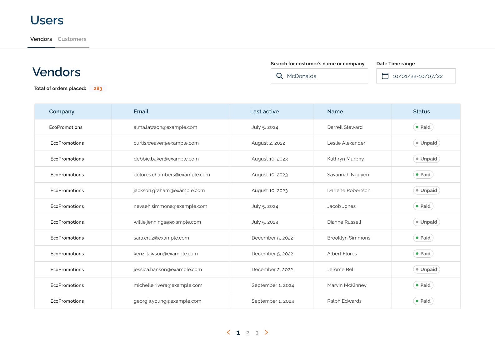
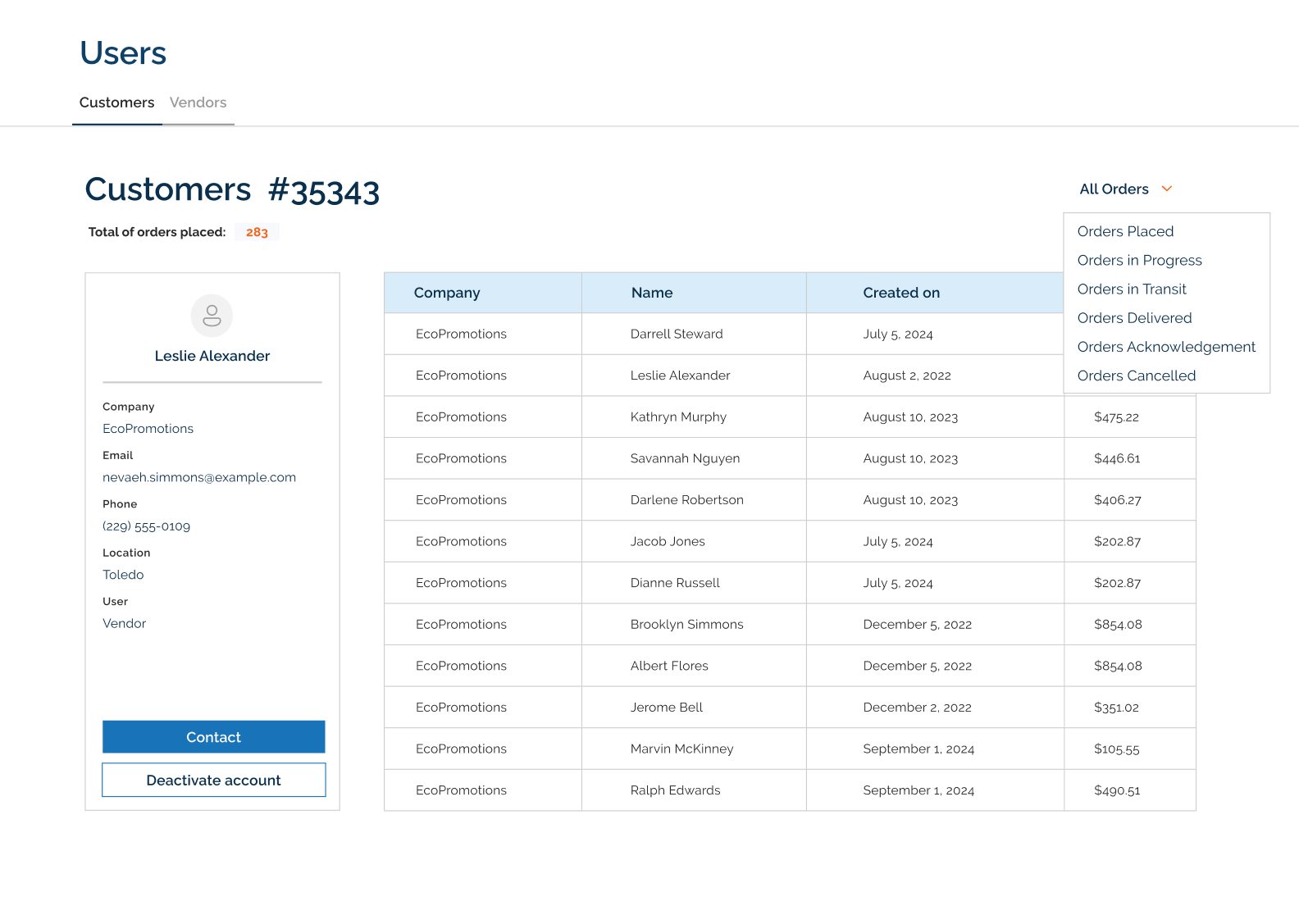
A B2B marketplace where food and beverage brands find suppliers, request quotes, and track every order, with an admin platform that keeps both sides running.
One place to source, negotiate, and track
Food and beverage CPG brands work with many suppliers at once: packaging, ingredients, services. Communication, orders, and payments were spread across email, calls, and spreadsheets.
Vendor Vault centralizes that relationship for three user types: brands buying (customers), suppliers selling (vendors), and the Vendor Vault admin team. The UX/UI phase covered about 41 screens over 12 weeks, as part of a three-designer team at Geekbears.
My role
How might we make B2B sourcing feel as clear as online shopping, without hiding the quotes, paperwork, and negotiation that B2B buying needs?
Three people, two sides of a deal
Emily needs one channel for all her vendors and on-time deliveries. Oliver wants new clients and faster, simpler payments. Alex keeps the platform secure and supports both sides.
MVP by role
Planned for V2
Mapping the system before the screens
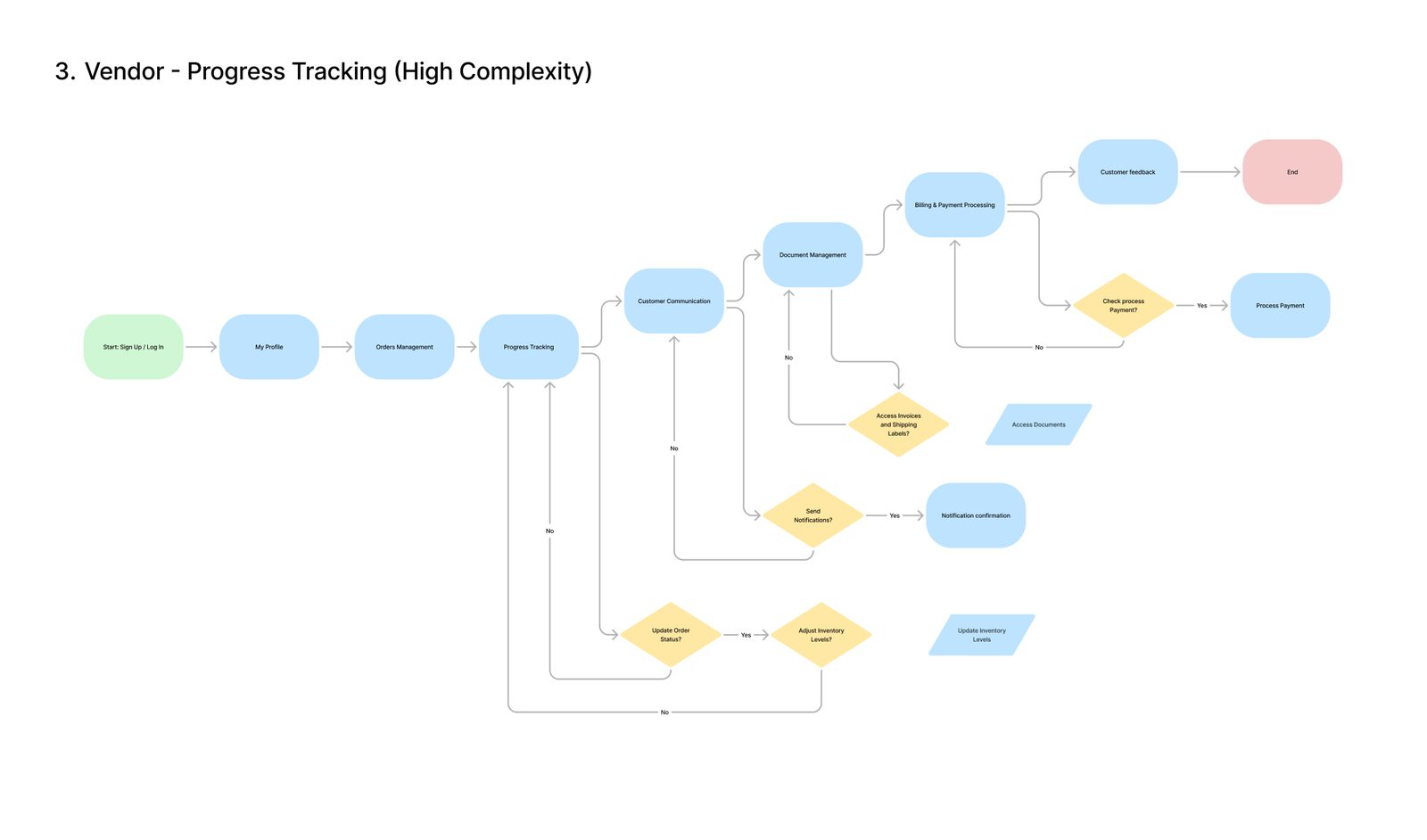
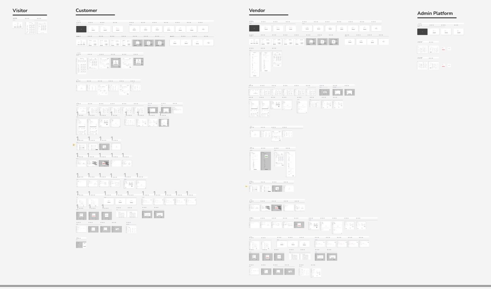
One system for three roles
After the client chose a style guide direction, I built the design system that all three platforms share: a primary blue scale with an orange secondary, neutrals, text and background tokens, icon states, and feedback colors for information, warning, success, and error.
Deep navy navigation with bright blue actions lets product photography carry the color, so dense tables and forms stay easy to scan.
Three roles, one shared language
I designed the high-fidelity UI and the clickable prototype on top of the system, so customer, vendor, and admin screens reuse the same components and statuses.
Customer
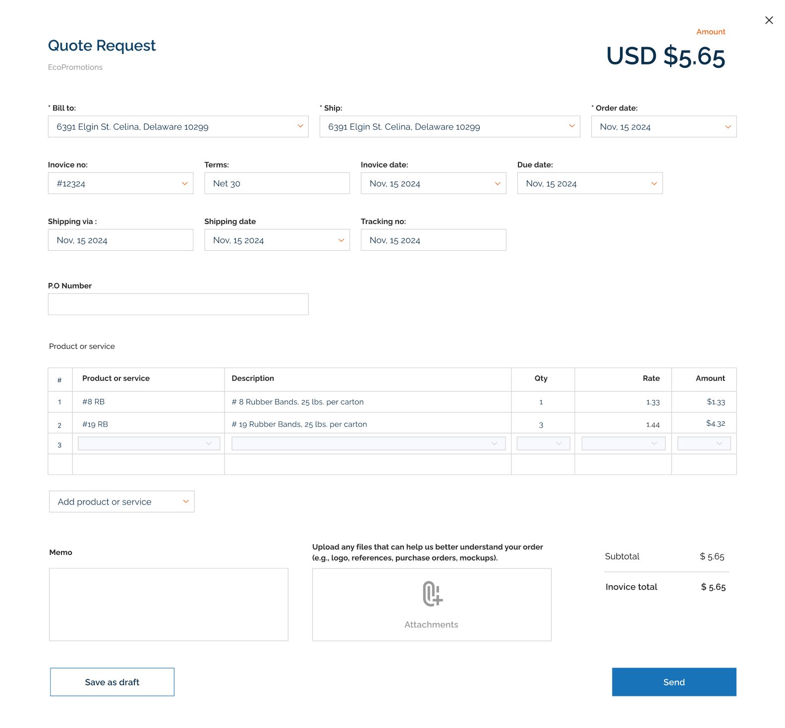
Vendor
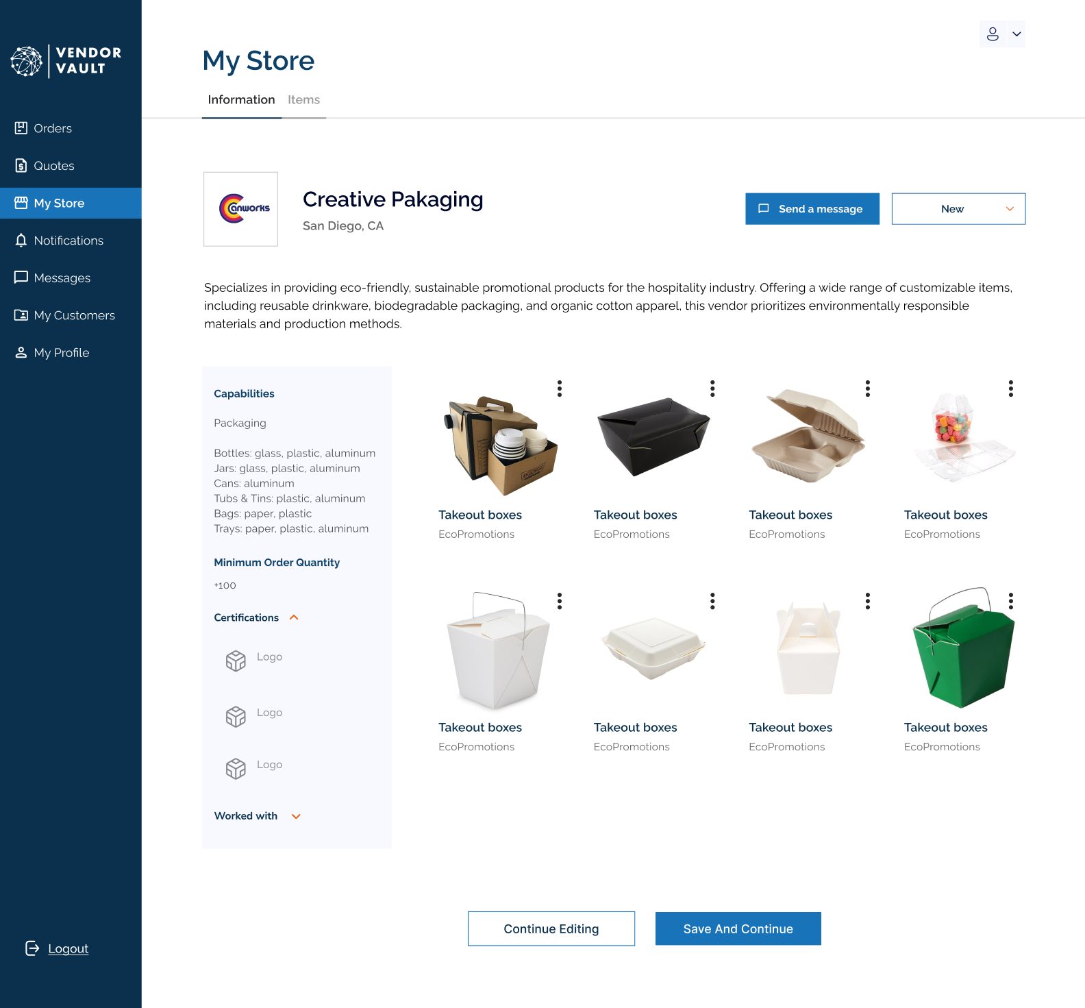
Admin
Designing for how B2B buying works
What this project taught me
Owning the wireframes and the design system for three roles taught me that consistency isn't sameness. It's a shared language: the same statuses, components, and patterns let a buyer and a supplier read the same order the same way.
In a marketplace, the interface is the contract between both sides. Clarity is what makes it trustworthy.
More case studies
SerenityMate
Recovery companion app and clinic platform.
View case study →Align
Book flights for someone else, with both calendars in sync.
View case study →